However After some thought I decided that I wanted to create something that could also act as an ice breaker, which would encourage the first years to interact with each other. In order to do this I thought I would create a board game incorporating the same concepts that I had pitched for the book.
Board game Concept.
Create a board game with a similar appearence to those such as snakes and ladders and monopoly.
Use a dice to move along the squares/spaces.
Create 3d card characters that appear like stereotypical graphic design students.
Incorporate cards when users land on certain spaces that send them back and forwards.
The Cards that send users forwards will be things students do to be more successful and ones that send users backwards will be things that first years shouldn't do, and will hold them back from acheiving.
There will also be cards, with need to know stuff about graphic design, that will increase the users knowledge and boost their points.
The person who gets to the end of the game with the most points, which marks completing the first year, will have made a journey across the board that shows people how to be more successful, the ones who finish the game with less points have had a more unsuccesful journey across the board and have learnt what not to do.
To research and design:
-Game board.
-How to play guide.
-Game box.
-Game cards.
-Cardboard characters (counters)
I am going to begin with some design concept research.
When on behance I found a board game that someone had come up with to communicate all the things that they had learnt in the first year of graphic design. An A-Z of graphic design. However the designer also gives tips on things to avoid doing when studying graphic design, Which will help me for my own concepts.
They have also created sets of cards to inform users of technical aspects of the course, definitions of terms and phrases, Font cards, to teach users about certain fonts and Quote cards that contain famous quotes from designers.


I also found some other designs on behance which I liked:
Behance
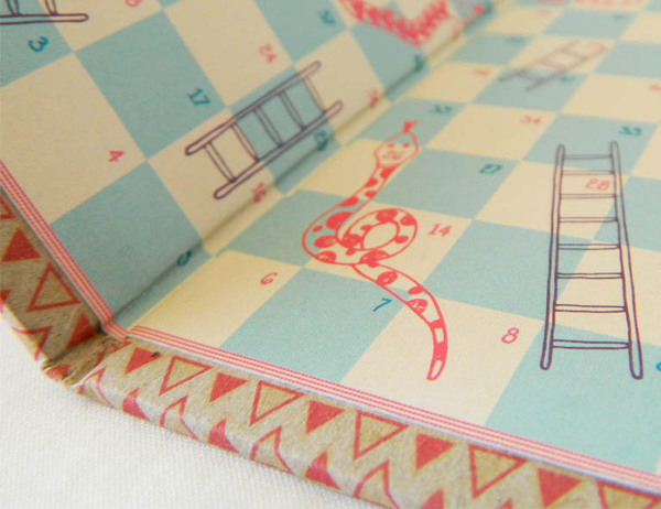
Although I thought about doing a snakes and ladders set up, where game players would move back and forth on the board due to landing on a snake or ladder alike space, this would not be based upon success or lack of success in the year and So I have decided against this idea.
Although I thought about doing a snakes and ladders set up, where game players would move back and forth on the board due to landing on a snake or ladder alike space, this would not be based upon success or lack of success in the year and So I have decided against this idea.

I also found this board game on behance, I like the shape in which the users have to travel in order to get to the end of the game. The use of shape is more interesting than the traditional checkered/box format such as those used in snakes and ladders and monopoly. The use of the shape also resembles the idea of a physical path which I find is more relevant to the idea of a journey. The implementation also allows space for compatible themed illustration, also semantically involved with the course.
I found another board game which I thought was themed really well, everything from the board itself, the box and how to play manual had been considered greatly to ensure they were consistent.
'ALIBI is a fast paced boardgame of intrigue and luck for 2-4 Players. The object of the game is to collect evidence [Coppers] or a rock-solid alibi [Gangsters] to present to the District Attorney. Players maneuver replica gangster cars or police paddy wagons during gameplay in a 1930s era setting.
The game is presented as a police case file box. This theme is carried through with the instruction booklet, which replicates a police case file folder. As you unpack the game you are taken into the “big city” of the 1930s. The copy, typefaces, typography, graphic elements, and three-dimensional game components continuously reinforce the theme. After a rousing game of Alibi, the color and graphically keyed box interior ensures the game can be quickly and securely stored away. '


I had already found a style that I would like to illustrate in from a book I have recently bought called called 'A History of Graphic design for rainy days' of which I enjoy the process in why they have picked certain colours/ 2 colours plus stock per page. I like the use of two colours, and how they are used to create focus on certain parts of the story, eg. characters, a certain message, or a piece of graphic design.


I do however also like the work of Graphic designer Kate Forrester, I particularly admire the way in which she designs, and like the element where she connects her main illustrations to the border of her works, almost in a paper cutting style. Attracting my illustrations to the edges of my board instead of around the path could be a more successful idea, as the images will not distract from playing the game.

This piece of work by Kate also applies to the idea I had previously stated where two colours could be used (against a different colour for backdrop) In order to initiate the story of the board game.

This pieces shows how small similar colours could be added in, in small doses to add extra detail and give more depth.


The above two Images show imagery connected with working, such as reading books and going on the computer, which could be good inspiration for any starting university imagery that i will need to make myself.

CONTENT
In order to get some primary research I asked the rest of my course, on our Facebook group, what they felt they have done and had been more successful on the course, and what they would recommend that they shouldn't do.

These were the responses that I recieved:
- I brought too much stuff to uni at first, less is more when you live only an hour and a half away.
- Not writing down notes in certain sessions, so haven't been able to remember what to blog.
Getting started on projects straight away so that I haven't rushed anything, and been able to do what I wanted. - part time job.
- Letting blogging build up.
- Not blogging enough and going out
-That budgeting my money was something i should of done.
-Not to think having a student loan means you can go shopping for clothes and shoes rather than food.
I have seen from people's feedback that there is an emphasis on things such as blogging, a part time job, going out too much and not budgeting.
I will use these don'ts for my playing cards alongside my own experiences and ones that I know others have talked about broadly.
I began to make a list of ideas for the 'UH OH!' cards, which will send users backwards on the board.
- You went out last night, stayed out too late and missed this mornings lecture.
- You handed in a module 2 days late and your grade is now capped by 10%.
- You were absent without proper reason and slowed down the progress of your group.
- You put off blogging until the end of the module and now you are behind.
- You were late for the train and have missed the morning briefing.
- You spent too long procrastinating and have only completed half of the task in for today.
- You have suffered a spell of creative block, step away from your work and take a short break.
- You spent too long with the other half this week and don't have much to present in crits tomorrow.
- You did an all nighter last night to finish a project but the work you produced wasn't great as you were too tired to concentrate. You now lack focus for todays classes.
- Oops! You quoted a designer/writer in an essay but did not reference it. This is a major issue!
- You spent all your money at the weekend and now can't afford to print your work. Remember to budget.
- You forgot to book a print slot and don't have anytime left. Remember to book in advance.
- You forgot the correct equipment and now you cannot complete the work in class.
- You didn't read the brief properly and have made some silly mistakes. Make sure to always have the brief at hand when completing projects.
- You skipped a class because you thought it wasn't relevant, but it was very important. All classes should be attended and offer a great learning experience.
- UH OH! You took on too many hours at your part time job this week and now you're struggling to keep up!
I have made a list of 16 don'ts here, I thought this was a well rounded number, as I plan to have 4 UH OH! spaces on the board. Having 16 of these cards means that if there were the maximum number of players playing (4) and they each landed on all 4 of the spaces, there would be a new card for each.
I then made a list of 16 for the success (Hell Yeah!) set. Many of the ideas I wrote down were opposites of the previous 16.
- You went out with friends last night but still managed to get a good nights sleep.
- You have finished all your module work 2 days before hand in and can afford to take a small break. Well done!
- You have 100% attendance and have turned up to every class. Great work!
- You have blogged everything you've done as you have gone along and you're on track for deadline.
- You have been visiting design blogs/ websites regularly to keep yourself informed with current design.
- You planned your morning well and have got to college 10 minutes before class starts.
- You booked a print slot in advance and your project is ready to be handed in.
- You managed to balance seeing the other half with work. It is important to have a balance between work and rest.
- You remembered the necessary equipment and completed work in class, instead of having to take it home to complete.
- You handed your last brief in with a great collection of supportive material, research, initial sketches, thumbnails and a range of design sheets. Keep up the good work!
- You did a great job working in a group last week by pushing your pride aside to do what was best for the group, your project was a big success.
- You took the time outside of college to visit an exhibition/ go to a graphic design event that furthered your knowledge.
- You notice some mistakes you've made after printing out your project but you have budgeted well and have more than enough money to reprint it.
- You took the time to go out and take your own photos for the next project where possible instead of relying on the internet.
- You took it upon yourself to go out and collect some primary research instead of relying on the internet. This proves good practice for the future.
- You made a study schedule and stuck to it and can move onto the next module with no overdue work on the back burner! Continue to do this for good practice.
You've got skills cards - 16 definitions/facts of terminology you will hear on your first year of the course.
Stock - The material that you are printing onto/ making a product out of. For example; Newsprint, card or wood.
RGB - RGB refers to the colour mode in which Images are displayed electronically, for example on screen.
CMYK - CMYK refers to physical colour such as paints and inks. When you are creating a piece of Graphic design on screen, make sure to convert the colour mode to CMYK before you print to see how the colours will translate in physical form.
Bleed - Bleed is the part of a printed document that is outside the bounds of the final size of the piece. It is used to make sure images and other design elements print all the way to the edge of the paper. This ensures that when the design is cut to size, it will fill the whole piece. quote
Body copy - Body copy is written text of an ad, brochure, book, or Web page. It's all the words. quote
Font - A font is a set of printable or displayable text characters in a specific style and size. The type design for a set of fonts is the typeface and variations of this design form the typeface family . Thus, Helvetica is a typeface family, Helvetica italic is a typeface, and Helvetica italic 10-point is a font. quote
Resolution - Resolution is the term used to describe the number of dots, or pixels, used to display an image. Higher resolutions mean that more pixels are used to create the image, resulting in a crisper, cleaner image. quote
Thumbnail - On the course you will most likely be asked to create a collection of thumbnails to support your work, this is referring to a range of small 'thumbnail' designs, which you will narrow down in order to come to your final design.
Typeface - The design of an alphabet or set of characters is a typeface. For example, Futura, Helvetica and Calibri. quote
Vector Image - Vector images are made out of lines and shapes in contrast to Raster images which are made out of dots or pixels. Vector images can be resized to any size desired and it will not affect the resolution of the image.
Raster Image - Raster images are made out of dots or pixels. When raster images are resized, more so when increased beyond their original size, it initiates a lower resolution.
Additive colour - If we are working on a computer, the colors we see on the screen are created with light using the additive color method. Additive color mixing begins with black and ends with white; as more color is added, the result is lighter and tends to white. quote
Subtractive colour - When we mix colors using paint, or through the printing process, we are using the subtractive color method. Subtractive color mixing means that one begins with white and ends with black; as one adds color, the result gets darker and tends to black. quote
Logo - A logo identifies a business in its simplest form via the use of a mark or icon. quote
Brand - The perceived emotional corporate image as a whole. quote
Identity - The visual aspects that form part of the overall brand. quote
I then moved onto creating content for my 'How to play guide' and decided what kind of things I would want to include.
- Welcome message.
- Amount of players.
- Aim of the game.
- Moving along the board.
- The 3 types of cards.
- Construct your own game piece.
Welcome message:
Hello! and welcome to your first year at Leeds college of art on Graphic Design. I know some of you might be scared (I know I was) and it all might seem a little over whelming. but just step back, take a breath and enjoy the journey you are about to embark on.
It might seem a little confusing at first and you'll wonder, like myself, how will I make it through the year? But that's why we're here! Us 'old folk' have put some things together to help make your first year a little easier. I decided that not only would I make something to help you out, I thought why not create something to help you break the ice and make a few buddies too! After all, us Graphic Designers son't all hate each other.
By the end of the game you should have hopefully learnt some tips and tricks of how to do well on the course, some don'ts that will hold you back from success, and a few definitions of Graphic Design terms that will help you get started. Good luck!
How to play:
2-4 players per game.
The aim of the game is to travel across the board, and collect as many points as you can. Your journey across the board is reflective of your journey through the year. The person who finishes the game with the most points has completed the year most successfully, and the person with the least points, is the least successful.
Each player has their own character which they will use to move across the board. Players more across the board by rolling the dice and advancing to the next space.
The fate of your success relies on three types of cards, 'Hell Yeah!', 'UH OH!' and 'You've got skills'. When you land on a space labelled with each of these you must pick up the correct card, read the message and follow the instructions.
Hell Yeah! - These cards display the things that will improve your success on the course. They will add points to your score.
UH OH! - These cards represent the things you should avoid doing as they will hold you back from being successful. They will deduct points from your score.
You've got skills! - These cards each include something important/ useful to know about graphic design and will increase your knowledge, they also increase your amount of points.
Construct your own game piece:
Pick which game piece you would like to represent you from the collection of four and simply construct your game piece as shown below.
(Add diagram at later stage when games pieces have been designed.)
Once you have finished the game take a chance to look back and see where you went wrong, and what you could do to be more successful. Good luck and enjoy the year!
No comments:
Post a Comment