Off the back of our first Design Principles session (Tues 23rd Oct) we were set a task for our next Design Context session (Fri 26th Oct) to find 4 images of graphic design in a5 scale, 2 of which we liked and two we disliked.
These are the pieces I have chosen of what I like:


(http://strictlypaper.com/blog/2011/08/fairy-tales-and-monsters-paper-cut-by-damian-ohara/)
This is a poster designed to promote an arts festival in London called 'Fairytales and Monsters'. The piece created via paper cutting and digital design by Irish Graphic designer Damien O'Hara represents my love for organic design and intricacy. This represented between the fluid interaction between each image and line. I also like the use of minimal colour, white being the most dominant which reminds me of one of my favourite processes, blind embossing.
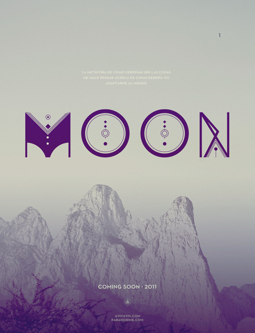
(http://paranoidme.com/ALQUIMIA-TYPE-TYPOGRAPHY)
Although I don't normally like geometric design I have become very interested in the process and product of type and I am now more appreciative of the outcome of type. I prefer the use of calming colours evident in the use of purple which is accentuated through the combination of neutral colours. I also like how the gradient has been applied to compliment the font, thus reiterating a more organic appearance than a geometric one.
These are the pieces I have chosen of what I dislike:

(http://www.flintriver.co.uk/blog/wp-content/uploads/2012/08/7f26cdaf392d7e0259f1e3d4446768ad86473d91_m.jpeg)
I do not like the art deco movement of which this work has originated from. Art deco contains a lot of motifs that celebrated progressing technologies such as trains, planes, cars and skyscrapers. gradients are used to give a metallic effect to substitute that metals could not be used in paintings. The progress of the art deco movement was reflected in a calibre of design, architecture, interiors and graphic design. Another element I find i do not like in the art deco movement is the use of geometric shapes and vivid colour.

(http://designinstruct.com/graphic-design/creating-abstract-geometric-artwork-in-illustrator/)
A stark contrast in colour and bold use of geometric shapes. There is no fluidity to the piece or existence of an obvious purpose. Although I do like the use of minimalism, the lack of flexibility is too bold for my taste. The composition lacks interest and does not push my mind to consider the piece more.
No comments:
Post a Comment