PRACTICAL ELEMENT.
HEAVENLY PACKAGING.
I am basing the dimensions of the chocolate bar off of already existing chocolate bars. The bar I will be designing for is of a larger size than an everyday chocolate bar and is one than can be considered a tear and share.
I will be using a Green and Black's chocolate bar measurements to create the packaging for my own bar. When considering how to do the packaging I wanted to consider how to make the chocolate bar look as normal as possible. Often, organic chocolate bars are packaged in boxes, made from rough card, however I feel that this aesthetic in particular gives the packaging a luxury feel which is something I am trying to avoid. Instead I have decided to go for a sleeve which will wrap around a foil covered chocolate bar. This method is not often used anymore, (can be seen on galaxy chocolate) and therefore It will stand out on the shelf.
Using the Green and Blacks chocolate bar I came up with a net size for the sleeve.
Next I will use the Green and blacks chocolate bar to distinguish the groups of information that needs to go on the back of the chocolate bar packaging.
-Brand name.
- Ingredients.
-Nutrition information.
-Nutrition information.
- Barcode.
- recycle symbol.
- Address of company for any issues.
This product meets the Roundtable of sustainable palm oils standards for palm oil harvesting.
- Best before.
- Size of bar - recycle shortened symbol - Suitable for vegetarians.
- Size of bar - recycle shortened symbol - Suitable for vegetarians.
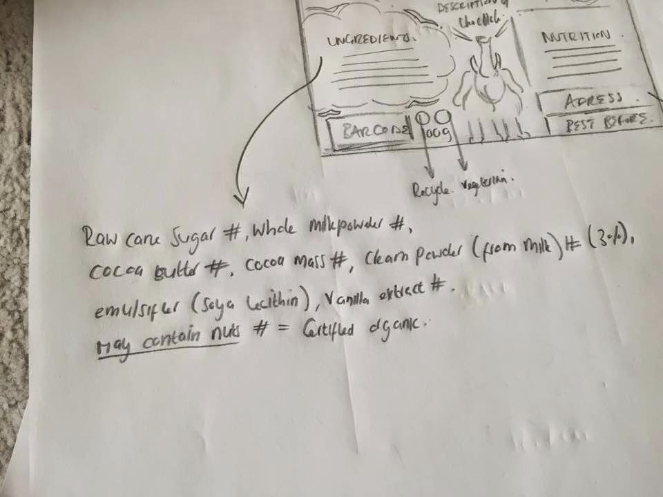
I want the back of the packaging to be as illustratively interesting and appealing as the front. I began to section the back into areas of where to place information. I followed the terms of heirarchy as seen on the back of chocolate packaging first introducting the brand and flavour and RSPO, then ingredients and nutrition, and towards the bottom; weight, recycling, address, best before and barcode.
I have added illustrative elements such as the clouds, beams and stars seen on the front of the packaging for consistency and inclusion of illustrative elements such as the elephant, whom is part of Heavenly's sustainable story, however this is not made obvious on the packaging.
Stock ingredients for the sake of the packaging have been taken from the back of a Green and blacks bar.
As has the mock address for the company.
Next I went onto making the original front cover of the chocolate bar, proportional to the net I have measured out.


No comments:
Post a Comment