HEAVENLY CHOCOLATE.
INSIDE WRAPPER CONTINUED.
With the narrative for the story created, I started to work digitally on designing some illustrations to benefit and reiterate moments in the narrative visually. I intended to use the same colour pallet as seen on the opposite side of the wrapper to keep consistency.
I want the illustrations to be simple and quite literal so that the message is easy to understand and clear, thus diminishing the concern of complexity. I also felt that simple illustrations using a limited colour pallet would make the issue at hand feel less overwhelming, and as attractive as the design on the front of the packaging.
Part 1: Here at heavenly chocolate we source palm oil sustainably from our plantations in Indonesia.
- Again this illustration is very simple showing a simple depiction of the pant/ingredient with arrows pointing to a simple shape representing the country of Indonesia.

Part 2: If every product that uses palm oil jumped onboard, an area of rainforest the size of 300 football fields could be saved every hour.
- The illustrations aim to be recognisable straight away in terms of what they represent (football pitch), below is a very literal illustration of the above narrative.


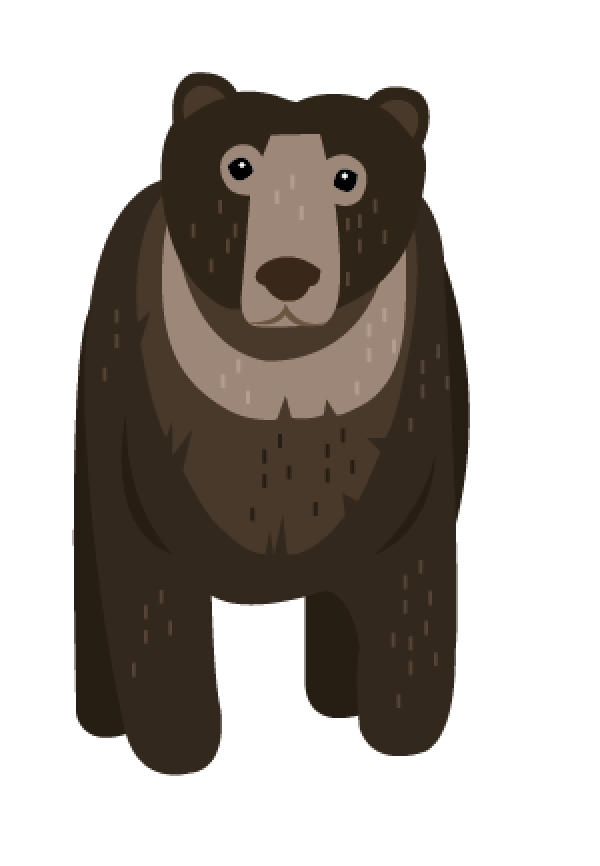
Part 3: Within the rain forests of Africa, Asia, North America, South America, Indonesia and Malaysia roam a community of animals including the Sumatran tiger, pygmy elephant and sun bear.
- Again for the animals in the below illustrations I took inspirations from photographs to try make them look as authentic as possible, but communicated this in a simple way, with the same small colour pallet and illustrations to remove the feeling of doom and gloom.


Part 4: When palm oil is harvested unsustainably, animal habitat is destroyed, as are the animals who inhabit the rain forest.
- Again the illustration I constructed is a very literal sense of the idea of animal habitat and animal homes.


Part 5: But thats not how we roll here at Heavenly. Their homes stay put and so do they.

Part 6: Its amazing what delights can come from one yummy bar of chocolate.

Part 7: Spread the joy. Snap it, melt it, love it. buy it, gift it. Share the moment. share the movement.
- I had considered incorporating another accent colour into the illustrations, however I want the pallet to be really reflective of the product at hand which is chocolate, and so I tried to create a contrast within the same pallet.


Part 8: Heavenly by name, Heavenly by taste, Heavenly by nature.
- The last illustration is just a simple reiteration of the original logo to keep the brand in the mind of the consumer after reading the story.

Next I started thinking about how I would structure the story and illustrations on the back of the packaging. It is important that simplicity and readability is considered at this point. I came up with two different ways to structure the story on the back of the wrapper that I thought would provide the easiest frame work for reading and understanding the Heavenly story.
The first (Shown below) makes use of how we read from left to right in a clockwise motion. Centered is the original logo with the additions of be a part of the Heavenly story and the illustrations with text, would be placed around this in a cycle formation.

An issue with this design is where does the story begin and when choosing a point (left, top and centre) how would it be indicated to the consumer for easy reading?
For the second structure Idea I considered further the natural way in which we read, from left to right and so this framework features a much more simple design. At the top the logo is featured, along with the additional information be a part of the Heavenly story, and then the Heavenly story takes place over 3 rows.
For the second structure Idea I considered further the natural way in which we read, from left to right and so this framework features a much more simple design. At the top the logo is featured, along with the additional information be a part of the Heavenly story, and then the Heavenly story takes place over 3 rows.

Overall I feel that the second structure is going to be much more appropriate for the piece as it promotes simplicity and ease, one of the main points put fourth in my project research.
Therefore I took the net for the opposite side of the packaging into illustrator and began taking the illustrations and text of the story (written in the same font used across the brand: Biko) and started placing it into a row like frame work, leaving space for a top and bottom border.

I managed to take the illustrations and text down to size size that was still entirely clear and readable, but would also allow a row of 3 illustrations on a line.

In order to do so I had to juxtapose each section slightly in order to make room so that the eye would skip fluidly from one part of the story to the next. I did not want to reduce the size of any of the components, especially the text as this could render it unreadable.

I continued to play with the illustrations adjusting the positioning in a ways that would make the structure easiest to read.

When adding the last row of illustrations I played around with the composition and instead encorporated the last part of the Heavenly story into the bottom border. I felt that this helped to create a simple statement for the brand using the recognisable and key phrase 'Heavenly by name, Heavenly by taste, Heavenly by nature.' also reiterated on the front side of the packaging. Also detailed are the social media platforms Heavenly could have, where consumers can learn more about Heavenly and interact with the brand.

Lastly I worked on the header which I designed to mirror the bottom border and also link almost identically to the original logo, to create an easily identifiable brand.
I also added some of the signature stars and sparks of light into the gaps to make the composition more visually attractive and reminiscent of the best of the brand.

No comments:
Post a Comment