Sunday, 25 November 2012

OUGD401: Context of Practice. Beauty, Style & Taste studio session.

For this studio session we were to arrive with two pieces of graphic design that focused on just text, another two just image and the last two image and text. One of the two had to be a piece we disliked and the other that we liked. 
The following are the pieces I brought in that I liked:

Text.
(http://www.behance.net/gallery/San-Francisco-Lettering/5898907)
I loved how this piece was so intricate yet simple at the same time. I found that the lack of colour only enhanced the piece and its fluidity, created by the use of render.

Image and text.

(http://www.behance.net/gallery/Pattern-Matters-Tangible-Paper-Infographic/3411991)
I thought this was a really innovative and inventive take on info graphics. Quite usually with info graphics viewers are bombarded with elements such as facts and numbers, however I love the simplicity of this piece and the use of 3D graphics. 

Image.

(http://behance.vo.llnwd.net/profiles/77742/projects/1316541/e0e570c4884690034eb4d3c5f071bf8c.jpg)
I chose this image as I really love illustration and the use of watercolour. However I also like the clever construction of the piece in which the trees slowly escape into the sky hugging the buildings.

The following are pieces I brought in that I disliked:

Text

(http://behance.vo.llnwd.net/profiles/57661/projects/498234/cdb9de16cd4341ffbfb0f05aea267a7d.jpg)
I chose the above design as a piece I didn't like as I didn't like the emphasis on geometric shapes, as well as the use of gaudy colour and uncomplimentary gradients.  

Text and Image.

(http://behance.vo.llnwd.net/profiles/51195/projects/53832/511951199384245.jpg)
I chose this piece both because I found it quite unreadable, and out of personal preference. The use of these particular patterns and exaggeration of black does reiterate the visual of a tribal tattoo which are not in particular to my taste. 

Image.
(http://entelekia.wordpress.com/2008/10/28/campy-art-deco-erte/)
I chose this image piece as one that I disliked as I do not like much design that comes out of the art deco movement. The constant use of geometric shapes and overuse of colours produces an image of clutter and chaos, not the simple and low colour usage I prefer. 

Equipped with our 6 pieces of design we got into groups of 6 and discussed what we liked and what we didn't like about the pieces we had chosen.
Afterwards we individually wrote a list explaining what we did like in the aesthetics of graphic design and what we disliked.

What I like:
Mixed media/ experimental media
Negative space
Subtle/ few colours
Elegance
Simplicity
Fluidity
3D
Clever.

What I dislike:
Gaudy colours
Too much colour
Art deco
Geometric shapes
illegibility
Business
Chaos
Overcomplicated
Too fine art.

After making these individual lists we made the same two lists again as a class.

What we like:
Clean
Simple
Legible
Structured
Geometric
Distinctive
Powerful 
Modernist
Sophisticated
Balanced
Professional
Striking
Intricate
Crisp
Intriguing.

What we dislike:
Cheap
Tacky
Generic
Garish
Cluttered 
Over powering
Busy
Messy
Unclear
Illegible
Chaotic
Overworked

After we had written these lists we were to choose 3 pieces of the work we had brought in one we liked, one we didn't and one other. From these 3 we were to write down 5 words for each from the class lists in which our described our personal opinions of the pieces of work. We then swapped our pieces of work with another person in the room and over a period of 35 seconds they wrote down 6 words for each in which described their personal opinions of the work.
At the end of this task we got back into pairs with the person we swapped work with and sat down in groups of 6 in which we went around the table and found out if people had the same kind of opinions as ourselves.

The three pieces I took into this exercise were 2 I liked and 1 I didn't. below are the images with both mine and Grace's opinions. 

 My Opinions:
Powerful
Simple
Sophisticated
Intricate
Intriguing

Grace's opinions:
Unclear 
Illegible
Dark
intricate
Overworked
Chaotic.

Grace thought I disliked this piece.


My opinions:
clean
Simple
Sophisticated
Balanced 
Striking

Grace's opinions:
Clean
Geometric
Legible
Crisp
Striking
Sophisticated

Grace thought I liked this piece.

My opinions:
Cluttered
Unclear
Overworked
Busy
Overpowering

Grace's opinions:
Garish
Clashing
Busy
Unclear
Overwhelming
Chaotic

Grace thought I disliked this piece.

We found through this exercise from getting 2/3 that we had similar rules of what was good graphic design and clashed on design in which we had a contrasting personal preference.

We then went on to create a list of rules in our pairs that we agreed was what made graphic design aesthetically pleasing. We had to make 10 rules, mine and Grace's are as follows:
1. Should be legible.
2. Image and type should reflect eachother.
3. Colours should harmonize/ balance.
4. Image should reflect message.
5. Should not be overcrowded.
6. Use original work - not always copy and pasting.
7. Use good quality images.
8. Visuals should not disrupt/ take away from the message.
9. Use no more than 3 fonts at once.
10. Use colour on the same semantic level as the message.

From this we were to individually pick 3 rules that we would use to judge design in a following study task, highlighted above are the 3 rules I chose. 


Wednesday, 21 November 2012

OUGD401: Street Art and Graffiti Lecture notes.

Graffiti of a political nature.
Caricature of a politician.

(http://www.wired.com/images_blogs/photos/uncategorized/800pxwwii_memorial_kilroy_was_here.jpg)

Kilroy/Chad - WW1
Engraving of Kilroy on the World War 2 memorial in washing D.C.
the outrageousness is not what it says but where it is found.

(http://ovineyards.com/english/wp-content/uploads/2011/12/nous-sommes-la-pour-boire-68.jpg)


Nous sommes le pouvoir.
Paris unrest 1968.
Figures are shown on the left holding a working tool and on the right raising his fist in a power salute.
The graffiti has merged all the figures together to create one figure, emphasising power.

(http://www.artofthestate.co.uk/photos/insa_tube.jpg)


1970's New york spray can graffiti.
Evolves alongside hip hop culture.
Making language of the streets visible.
Announcing their presence, they will not be ignored. Spraying onto tube cars means that the art and message will travel further, therefore seen by more people.
Portrays the dissatisfaction of class and hierarchies, mostly from less wealthy parts of New York that would travel into the more affluent areas.

(https://blogger.googleusercontent.com/img/b/R29vZ2xl/AVvXsEhZtGrJ8br_43KiHr9b1wUnS8pD4R3JF26IHIug51qzba7W-UWQF-Vb6rywIZCqddCf4WbDLiInHp8S_Gt1E9yLeDHpLQjgrjqDvYUqtd-EhvG85LMcf4Qn5lhyphenhyphen1udKyAx0vcgClivydPY/s640/126036_45JUF6WC7FRINFZAG5PPKR4V27DVAJ_samo_H203507_L.jpg)


Graffiti brought into the art world by Jean-Michel Basquiat.
SAMO. Same old. Intertwines messages and visuals. 
Poetic but confusing style 'Life is confusing at this point'

(http://www.brooklynmuseum.org/exhibitions/basquiat/street-to-studio/images/visual_samo.jpg)


Death of SAMO.
'SAMO IS DEAD'.

(http://news.upperplayground.com/wp-content/uploads/2011/03/f8400d40fcsquiat.jpg.jpg)


Warhol and Basquiat
General Electric with waiter 1984.
One of Americas largest operations.
profited 14.2 billion dollars in 2011 and avoided paying tax.

(http://fashionstyleblog.com/wp-content/uploads/2010/05/keith-haring-radiant-baby.jpg)

(http://www.gwarlingo.com/wp-content/uploads/2012/09/Keith-Haring-on-Street.jpg)

Keith Haring, Radiant baby, 1990.
Added his work to other works such as advertising by often sketching pictures/murals questioning sexuality alongside on black paper.
Making money out of work that originally had a social message.
In subways, breaking down the barrier between high and low art.

(http://upload.wikimedia.org/wikipedia/commons/a/a2/BrokenPromises_JohnFekner.jpg)

Move of the written word, graffiti into fine art, with social message.
John Feckner, broken Promises, 1980.
using word art in a street setting to portray social message.
referencing the misuse of buildings in the city, people are homeless yet there are many empty buildings.

Jenny Holzer makes statements that state the obvious, wanting viewers to think about and consider the obviousness of the statement itself. Wants the viewers to ask themselves, what do these statements mean to me? Below are my 3 favourite pieces of Jenny Holzer works that were a set projected


(http://www.todayandtomorrow.net/2009/02/24/jenny-holzer-projections/)


(http://upload.wikimedia.org/wikipedia/commons/8/8d/Feliz_1984.JPG)


Berlin Wall - Feliz 1984.
An emblem that technology was lacking in west Germany.

(http://farm3.static.flickr.com/2713/4425660137_7e7409a511.jpg)


TATS CRU 1997 for coca cola. 
Graffiti explored in gaming, usually to symbolise freedom.
Tagging in games such as grand theft auto.


Invader french artist, born 1969.
Uses tiles as they are harder to remove than paint, they have permanency and are highly unlikely to be removed by the council. Started in France and then travelled across 22 different countries.
Visual - Space invaders.
Attack of montpellier was a piece of work in which Invader placed tiled pictures of space invaders allover the french town of Montpellier and the public could follow and find these tiled space invader pieces he had placed in the locations on the below map, similar to a game of pacman.  

(http://3.bp.blogspot.com/-4Kr06zMWviM/T4SHQDtIQfI/AAAAAAAAB9M/X9tpiaDZjiI/s1600/mapmontpellier.jpg)

(http://upload.wikimedia.org/wikipedia/commons/thumb/4/45/Space_Invader_-_2007_-_Shoreditch_-_1.jpg/1024px-Space_Invader_-_2007_-_Shoreditch_-_1.jpg)


Wednesday, 7 November 2012

OUGD401 Lecture: Beginnings, A History of Creative Advertising.

Notes copied down from Presentation by Janine Sykes.

Lever born in 1851. 

1851 Great exhibition.

'Colour printing on a large scale was not practised until well into the nineteenth century...with the publications generated by the Great exhibition 1851' (http://www.slideshare.net/GretaMedelyte/a-history-ofadvertisinglecture1112new)

Britain had the largest empire in the world as was the most rich at this point.

Pre packaging.
1860's cereal companies figured out how to print, fold and fill cardboard boxes mechanically.
John and William Kellog.

Lever - 'I was the first to advertise extensively (and pre-package) a tablet of soap'
http://www.slideshare.net/GretaMedelyte/a-history-ofadvertisinglecture1112new

Advertising boom.
Advertising aided by tax cuts on newspapers 1855& paper in 1861.

Printing boom.
Technological progress in reproduction and colour printing, pictoral ads in magazine 1880's.
1890's technology abled paintings to be reproduced.

Lever.
born in 1851 at the height of the empire, international trade routes established.
International exhibition prompted large scale colour printing.

Lever brothers.
Adveritising transformed company. - multinational.

Lever brothers started to use contemporary paintings in their advertising. (Lewis, 2008, p65)
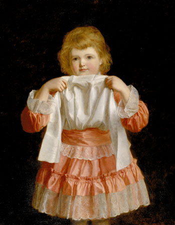
The new frock (1889) used in sunlight soap with copy 'So clean'.
Used paintings of children, women, white linen, delicates etc.


(http://www.liverpoolmuseums.org.uk/ladylever/collections/graphics/large/thenewfrock_large.jpg)


Alice in wonderland exhibition at the Tate liverpool Nov 2011- Jan 2012.
Infant morality rate was high. (19th Century)
Children popular subject.

Paintings and photography.

Signified joy, blessings, purity, innocence and life.

A dress rehearsal (1888) bought by leverhulme. Dress has been passed down by mother and edited for the daughter, for soap 'As good as new'. Uses emotional strategy enhanced by naturalism. Soap for clothing.


(http://www.liverpoolmuseums.org.uk/ladylever/collections/graphics/large/adressrehearsal_large.jpg)


selecting and presenting contemporary artworks (RA) communicated more powerfully a desired message.
Message was told in an interesting and innovative way.
Imagery provided a spectacle and entertainment.

'Adveritising from the moment it was born, was trying to entertain us' (Haggerty)
New lynx campaign.

Lever was among the first global campaigns.
Medicine, chocolate and soaps were among the first to be advertised globally.

The wedding morning (1892) John Henry Frederick Bacon. Bought this painting and began using product placement, taking out pieces of the painting and replacing it with sunlight soap.

1892 Sunlight soap got a royal endorsement from the queen. 

One method of beloved advertisers was to capture the children. (Lewis)

Lever spent 2 million pounds in the first two decades of making/ advertising soap.

Art direction.
Gross suggested plantol (another soap owned by lever brothers) should depict tropical climates and express the care that is exercised in refining oils.

Using ambience.
Innovative spaces. Installations (adverts in train doors) Was careful of where he placed his adverts not putting them in newspapers, and choosing media carefully. (Leverhulme)
Lever amassed was among the innovators of advertising expertise.

Salvation with sunlight.
Many of his earlier adds emphasised that sunlight soap would save women from drudgery. (Lewis, 2008, pg74) Would provoke ease in daily routines. Save time.
Copy in sunlight was directed toward working class housewives. Copy heavily emphasised using the soap would save more time for romance.

20th century- Lever used different international agencies.
Domestic and Imperial markets. Signs of britishness suited all - reference to empire.
Royal imagery appeared all over products packaging etc trading on britishness.

Empire was celebrated on biscuits, cigarettes, soap, chocolate became part of the 'working class fabric'.

Advertisers made it their business to persuade consumers of their hygiene problems.


Psychology of advertising.

skipped slide. thanks teach.

Discrepancy theory.

'Fundamentals of honest business with continue to advance humanity to brotherhood' (Leverhulme)


Sunday, 4 November 2012

OUGD401 Studio session 1: Critical analysis Task.

Task
Based on the material, exercises, discussions and concepts introduce during the sudio session:
Identify and explain 5 reasons why critical analysis is an important part of education, learning and devloping your understanding.
Identify and explain why the crit (group critique) is useful in the development of your work, skills and opinions.
Choose 5 criteria from the list that were generated during the studio session. For each criteria brefly summarise what will generally affect how you judge what you like and dislike when analysing examples of work. (you should aim to use the images that you brought to the session as examples).
Research Sources/Further Information
The critea by which you 'judged' the quality, effectiveness and appropriateness of the examples of work in the session included:
colour, layout, communication, visual content, non-visual content, function, quality of execution, legibility, audience, context, concept, message, media/method of production.

1.Identify and explain 5 reasons why critical analysis is an important part of education, learning and devloping your understanding.
- I am able to see which are my weak areas are, and what I should do to Improve these.
- I am able to see what I am strongest at, and so I can accentuate these points. 
- I am able to gain others opinions/ hear their ideas which will enable me to broaden and strengthen my work.
- I am shown what threats/ obstacles could arise when I further my work and I am advised on how to tackle these.
- I can discover what opportunities are available to further my work and be advised on what is the best root to take.

Group crits are not only great for receiving feeback from both peers and tutors, but they also enable me to talk more freely and confidently about my work, which is an essential skill in the graphic design industry. I learn where my strengths are and what works well, and what can be improved. Looking at a calibre also helps me to shape my opinion on what kind of graphic design I like, and what aspects of my work is most favourable. Group crits are also great for development, as in the studio session we found that as a group we all had pretty much the same opinions on what is good and bad in graphic design therefore creating a common criteria, and a knowledge that the feedback that we get from other students in crits is just as important as that given by tutors.

communication
Is its message clear and understandable? Is the form detracting from its function? Its communication its priority? Has it got the whole message across?


(http://strictlypaper.com/blog/2011/08/fairy-tales-and-monsters-paper-cut-by-damian-ohara/)
 The Poster has no clear indication of its function which is to promote an arts festival, although the visual design is breath taking I feel this has been more of a focus than the communicative prospect. It does get part of the message across, the imagery presents a subject semantically the same as the title. There is a date on which the festival takes place. However what the festival is for will take some underlying knowledge.

Media/ Method of production
Was the process Lengthy? Has It taken a lot of skill and attention? Does it work with the message? Is it the most appropriate media for the function?
When looking at design I generally prefer design that seems like it has used a lot of skill in order to create, The above for example is a piece I picked for a previous task that I really liked. Paper cutting is very intricate and takes more time to produce. The way in which it has been used as a pose to illustration is also influential as it opens up ideas for design and also dictates the idea that only one colour is needed to use.

Audience.
Is it successful at appealing to the right audience? Is the language and visuals used appropriate to its viewers?
 Inclined by tone of voice and language used, more simple if aimed at a child, more developed if for adults? Do the visuals connect with the viewer? Are they on the same semantic level? 

Legibility 
Is everything visually understandable? Is writing clear? Is there any confusion? Is everything decipherable?

(http://www.pplusp.co.uk/index.php/2011/11/29/promisesposter-design/)
The above is what I would classify as totally illegible. The writing is not clear and understandable. The writing is in a different language but this is also undecipherable due to the extreme lack of readability. There is no consideration for elements such as tracking, kerning or leading, that would make the piece more legible. 

Visual content.
Does visual content reflect the message? Does visual content aid the message? Does visual content have a good relationship with message or is it incoherent?

(http://www.flintriver.co.uk/blog/wp-content/uploads/2012/08/7f26cdaf392d7e0259f1e3d4446768ad86473d91_m.jpeg)
Large illustration of train is a representative of function, to promote a mode of transport, also relevant to cultural and social issues, as at the time of production, viewers were celebrating the progress in technologies  one of which was transport.


Friday, 2 November 2012

OUGD401 Context of Practice: Study Task 4.


Task.
Find 5 images of Modernist graphic design and 5 images of postmodernist graphic design. Write a short critical analysis of each image, which focuses on
a) Why you consider each image to be Modernist / Postmodernist
b) Whether you think that the image is successful or unseccesful
c) relate your analysis to the terminology introduced in the session
d) Use at least one quote from the essay by Massimo Vignelli to back up your analysis
Modernist.

'To make it better not only from a functional or mechanical point of view, but to design it to reflect cultural and ethical values, ethical integrity. Integrity of purpose, materials and the manufacturing process... The solutions should reflect the the approach taken.' (Massimo Vignelli. Long live Modernism!)
Modernism is the consequence of its process, it is an attitude that rejects ornamentation and finds beauty in its materials, construction and manufacturing process. And so begins the concept of function over form, In which any design of the modernism movement had a priority to be successful in its message or intentions In comparison to it's visual aesthetics.

(http://liamlewison1.blogspot.co.uk/)
Experimental Jetset.
Here is a classic piece of modernism by Amsterdam based graphic design studio Experimental jetset. This studio in particular are an emblem of what is considered Modern graphic design. They stay true to their function  not detracting from this by trying to accentuate the form. Above shows evidence of Modern graphic design though emphasis of left alignment text, sans serif font (Helvetica) and use of two block colours. It is succesful as there is no manifestation of decoration of which modern decoration, through careful consideration as to not even use a serif font, as this was acknowledged as ornamentation.

(http://www.changethethought.com/tag/bauhaus/)
Cover of page magazine.
The above piece demonstrates some familiar values that can be seen in the Experimental Jetset piece. It uses a sans serif font, this typeface however is more geometrical which is also a strand of style that weaved throughout modernism. Such as emphaisis of the square in architecture which was used as functionally they promoted more space, as seen in the bauhaus building. text is either aligned right or left and never central. Smaller text creates a dynamic that seemingly adapts to the grid like formulae that came around in modernism, and again only two block colours are used. 

(http://sgustokdesign.com/face-page-magazine)
Page Magazine.
Another example of modernism from Page magazine. The photography takes up the whole page, as this is the main function, it is the subject of the cover, it is simple and truthful and not distracted by decoration. This image also shows evidence of heirarchy which was established during the modernism movement as a form of organisation. Again there is only two colours being used for text all of which is aligned either left or right.

(http://www.goigloo.com/portfolio/print/backofthevan)
Flyer for a play by Igloo.
Following on from the last piece this flyer for a modern play demonstrates immediate consideration for hierarchy. 
'The flyer uses a two-column grid that suggests an obvious order, but there is no apparent order horizontally. This creates a chaotic sense of space, and has its roots in Swiss/Modernist graphic design that makes use of functional yet unexpected layouts to create interest.' (http://www.goigloo.com/portfolio/print/backofthevan) The grid was a heavy assest throughout the modernism movement. A select two primary colours have been used, aswell as a sans serif font. A reductive format is obvious, naturalistic illustration is abandoned and geometric planes and drawings are implemented due to the notoriety that cubism and futurism have held on the modernism movement.

(http://www.goigloo.com/portfolio/print/frui)
Frui upmarket breaks brochure by Igloo.
Clear affirmation of hierarchy, through change in size and weight of text. All text is black and aligned left. This is made the critical function, which is made obvious by the existence of heavy white space. Also obvious is the   assertion of the square, a feature implemented through the influence of cubism. It is a successful piece of modernist design as we are not mislead by the design, the design has followed the function, it has not been abstracted in the process.


Post Modern.

(http://rradar.net/post/30783495222/post-projects)
This piece is an expression of post modern graphic design due to its lack of restraint in relation to hierarchy, organisation of text and its relationship to images. Images have been selected in a random order and juxtaposed against text. We can also see an introduction of overlapping image and text, bottom left, overlays and more bright gaudy colours. 

(http://www.itsnicethat.com/articles/sara-cwynar)Aesthetics of control book by Sara Cwynar.
A piece of work that emphasises aimless and erratic layouts that were of popular use during the post modern movement. Regular use of overlapping, text that has no relevance to images, and a priority of form over function. (A function is indecipherable in this piece). There is a random and meaningless use of geometric patterns and symbols used throughout the post modernist movement which can be seen above.
(http://distortedesigners.com/forum/viewtopic.php?f=89&t=2257)
Gorgeous isn't good enough.
The above images holds prominence in the style of collage which was common in the post modern era, derived from the punk movement in which collage was used for many musical publications. There are a mixture of textures of which are uncomplimentary and can be deciphered as kitsch. Text has no particular order and is not adapted to any form of grid system as generally found in the modernism movement. Text is neither combined by a constant style or size and some of which can be seen in a pixelated form combating clean line fonts of modernism and accentuating imperfections. 
   
(http://s-pritchard1013-cts.blogspot.co.uk/2011/03/5-examples-of-post-modern-graphic.html)
Many pieces of post modern design started to implement images that composed of 3d dimensions, as if the viewer is looking into the image. Again there is a random attitude to where text is placed, and the perspective at which we view this. Actual image has been altered to seem more unclear, a notorious concept that ran through the post modern era, was to take something and accentuate the bad in it, bad design, which was then celebrated. 

(http://mubi.com/notebook/posts/movie-poster-of-the-week-hunger-and-the-quay-brothers-favorite-polish-posters)
Polish movie poster.
Another example of collage, Images and text overlapping. Although smaller bodies of text are grid like they are separated by bars. This was a common feature throughout postmodernism where text is both separated and written within bars. Text has been written on different levels (headline) not for functional purpose but only to accentuate form and layout.