COP2.
PRACTICAL PROJECT / BARBIE.
DESIGN DEVELOPMENT.
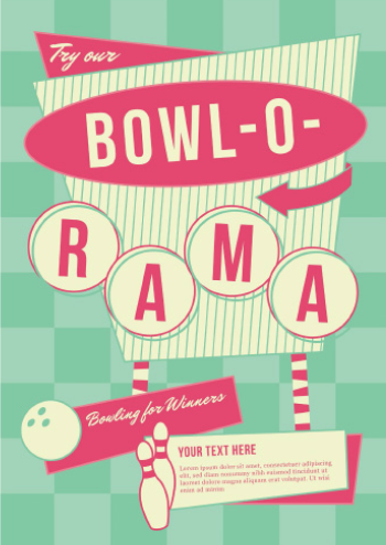
Today I began sketching up ideas of the back of the box, in terms of aesthetics, I was very much inspired by 1950's design. Since Barbie was released in the 1950's and this year marks the 55 anniversary since the first doll was released, I find this style very fitting.
What inspired me most about this style was the fun and quirkiness, and also the vintage and retro appeal, communicated through random and interesting motifs and shapes.

A vintage 1950's shoe advertisement:

I put some combinations of shapes together in reference to my work, as seen in my sketches. Each piece of technology within the box (Barbie's laptop, tablet and mobile) will have a sequence of these shapes as seen below. The pieces of information inside the boxes are a simple representation of how technology has forced us to think, the opposite of what Mcluhan has prescribed. This is shown through a quote, or two made by Barbie about a piece of technology, and an illustration of the piece of technology.
Barbie is a large icon for many children, and children learn whilst in play. Here, growing children are being taught by Barbie, how to live in the realms of the modern world, in which internet, mobile phones and other devices are the new modes of communication.
Below, they are taught that by possessing a laptop, they are able to do so many more things from the comfort of their own bedroom, than if they were to go out and complete a task, thus taking the social aspect away from the activity, such as shopping, and instead leading the child etc, to live a more integral life. This however not only applies to more materialistic commodities such as clothes and accessories etc, but also necessities such as food and drink which can be ordered online and delivered to your doorstep.

The same principles are communicated in the combination below. In which the information states 'I miss Ken, Lets video call him!' Previous to the internet, which is the only current way we are able to video call anyone, If you missed someone, you would have to go outside and pay them a visit. However with this new evolvement of the internet, we no longer even have to leave our bedrooms to see our loved ones, again echoing the idea of a more isolated lifestyle, which allows people to live solely within their homes.

Now that mobile technology has graced us with the invention of the front camera on an array of mobile phones and tablets, we are able to take pictures of ourseleves more easily, leading to the worldwide phenomenon that arose in 2013, 'The Selfie'. From this we now see a population that is more obsessed about taking photos of themselves, and how they look, than capturing memories with friends or well enjoyed holidays etc. Again leading us to become more self involved.

With most of the content decided I began working on the net. I themed the net with a link to the inside of the box by incorporating the pattern I had used for Barbie's wallpaper onto the back. I also made use of the 50th anniversary motif, (Barbie's head inside a circle) to make a link to the original branding. I also thought, that as this motif was a nod to the first release of Barbie in 1959, it has the vintage and retro aesthetic I was aiming to contrive for the rest of my box.

Next I began putting all the technology combinations into place on the box. I also came up with the idea to include a map on the back of the box which would specify how much of a global icon Barbie is, as I had learnt that she is sold in over 150 countries worldwide. the map would also imbue a sense of how much western culture is seemingly taking over the world. I parodied this idea by labelling the map, not with a list of which countries sell the doll, as this would be much too long to put on the back of a box, but instead, communicating the idea that although we are supposed to be living in a smaller world, many people of the west, would not be able to point out an eastern country on a map if asked. Whereas, If it were to be the other way around, people are easily able to point out western countries as they are so dominant within the world.


I also slightly changed the aesthetic of the combinations to make them easier to read for the user. Creating a colour sequence, that allows the user to understand which boxes are associated with each other.

I added the labels to the top of the box to indicate that the Barbie was supposed to be a 55th anniversary Barbie, in which I labelled 2014 Barbie to reiterate the idea that what is seen on the back of the box, and what this Barbie is branded is is reflective of culture in 2014, and therefore the 21st century. Giving a visual representation of how Mcluhans global village thesis, has actually materialised.

I also added a couple of other details, in which I took two components seen on a regular Barbie box and manipulated them. These components further pursue ideas that there is not much real empathy or knowledge of what goes on outside the western world. The dolls in which we purchase, not only Barbie, but many other brands are made via cheap labour across the east and through Asia. I have also noted in the second motif that the purchase of the doll, especially in eastern countries, will lead to a weakening of culture, and a stronger stance of the western way on eastern soil. Much like the growth Of Mcdonaldization I speak of in my essay with reference to Ritzer.

Next I designed the objects which I would be placing into the box with barbie. These include; The tablet, the laptop and the mobile phone. I decided to make these alike to the toys I recieved with dolls when I was younger. Creating a shape out of wood or plastic, than aplying stickers to the surface of these to make them appear like a certain object. Below are the stickers I designed for the objects.
Here we can see Barbie video calling ken on her tablet.

shopping online on her laptop for clothes.

and taking selfies on her mobile phone.

When applying these items to the design on the back of the box, I changed the shapes in order for them to comply with the rest of the design and fit in with the 50's theme.

The last section I added to the box was in light of Barbie's 'extra accessories' which consisted of Barbie's standardised house which could also be purchased from the range. The idea of Barbie's standardised house further mimics the idea of a standardisation in reference to the way of living and also to Mcdonaldization. Architecture is a clear image of how design is becoming more standardised. Here I Parody the idea that housing design is becoming standardised, Housing designs are created, and can be cut and paste into any location making them more space and cost effective, and therefore accessible to a larger range of people from different class backgrounds etc, Distributing this via a Barbie which is sold to many different countries promotes the travel of this Western way of design even further.
The illustration is again inspired by the 50's theme, a running aesthetic on the box and also caricatures the image of a standardised house.


Below is the overall design for the back of the box net.

To further improve the aesthetics of the design, and adapt them more so to the other anniversary boxes produced by Barbie, I wanted to foil the 55th anniversary emblems seen on both the front and the back of the box. However when I went up to the foiling facilities at uni, I was not able to get a screen as they were all taken, and with the bank holiday looming, I will not have time to foil the box the day before hand in, for fear that this could go wrong and I wouldn't have the time to fix it.
However not foiling the design does not compromise my final piece, as what Is very much important within this piece is the function rather than the form.


No comments:
Post a Comment