|
|
I
have learnt how to research more thoroughly, and more so the more
critical things rather than general research. I have learnt how
to narrow down this research, to input the things I need to use/
display to support my work, and get rid of the things that I do
not need. I have also learnt how to use the Harvard referencing
system and have ensured that each of my quotes has been
referenced to my fullest potential, this is evident in my essay,
and will be useful during the years to come. I have worked on my
academic writing style to ensure that I make points in an
effective and appropriate way, this supported by evidence by a
range of academic writers appropriate to the subject.
|
|
2.
What approaches to/methods of design production have you
developed and how have they informed your design development
process? |
|
The
main approach to design production I have developed Is
consideration of different medias, I did consider screen printing
my final design for my publication, however planning to do this
informed me that in order to complete this task I would need to
set aside more time, or have a simpler design.
The
main method of design production I have researched into and
developed an understanding for it binding, not only picking the
bind that would work best for the book, but which will echo the
style in which my design takes upon. For example changing from a
corcertina bind to a binding ring bind during the production of
making my publication, as the latter was more appropriate.
|
|
3.
What strengths can you identify in your work and how have/will
you capitalise on these? |
|
I
think the biggest strength in my work is the display of
understanding in both my Essay and my publication about the
subject of Modernism. Whilst my essay shows an understanding in
my own way, and portrays my own opinion, the publication I
created takes this to a whole new level, by taking what I have
learnt and translating it to a point where others (of a younger
age group) may understand. I also think that my work,
particularly the publication, shows in every aspect how I have
considered the subject of modernism, the content, the
inspirations behind the story (wassily chair etc) the typeface I
have used (Universal), the style of illustrations and the binding
techniques all reflect my understanding of Modernism.
|
|
4.
What weaknesses can you identify in your work and how will you
address these in the future? |
|
I
think the weaknesses aren't particularly in the end products of
my work, but took place in the process and production of
completing the work. For example, not being able to screen print
as I felt there would not be enough time, In the future I will
ensure that I am preparing my screens as I design to save time
once my designs are completed, I must also remember to come to a
final solution and stick to it, instead of attempting to change
this and 'perfect' my designs, as this will be a never ending
battle. Next time I should also make sure that I have enough
stock to make sure I can reprint what needs to be reprinted, as I
did not have enough of this to respond fully to the feedback I
was given by my peers and tutors.
|
|
5.
Identify five things that you will do differently next time and
what do you expect to gain from doing these? |
|
Set
aside enough time for longer printing processes to achieve a more
accurate and desired solution to a design that you have committed
to.
Ensure
that I have enough of the materials etc used for the project, so
I can respond to the given feedback to the best of my ability.
Research
design solutions to the fullest in order to not have to change my
design solution mid way through the project. (For example:
Binding my publication)
Attend/
catch up on all lectures as soon as possible to avoid falling
behind and to increase my range of knowledge on design topics.
Complete
individual research on topics we have been informed upon, to
further increase my knowledge without the input of tutors.
|
|
6.How
would you grade yourself on the following areas:
(please
indicate using an ‘x’)
|
|
|
|
Attendance 4 |
|
Punctuality 5 |
|
Motivation 5 |
|
Commitment 5 |
|
Quantity
of work produced 5 |
|
Quality
of work produced 4 |
|
Contribution
to the group 4 |
|
The
evaluation of your work is an important part of the assessment
criteria and represents a percentage of the overall grade. It is
essential that you give yourself enough time to complete your
written evaluation fully and with appropriate depth and level of
self-reflection. If you have any questions relating to the self
evaluation process speak to a member of staff as soon as
possible. |
Monday, 6 May 2013
OUGD401: Self Evaluation - Module Evaluation.

OUGD401: Design context - context and Chronologies critical writing essay.
Sarah Goldthorpe
OUGD401: Design Context
CONTEXT
& CHRONOLOGIES: Critical writing essay.
Focusing
on specific examples, describe the way that modernist art and design
was a response to the forces of modernity.
'Intellectuals across Europe
engaged in a revolutionary project to set western civilisation upon a
new foundation: Modernism. Rejecting classical and traditional ideas
of aesthetics, Modernists insisted that the arts should be founded
upon new forms, practice's and values derived entirely from the
contemporary moment and orientated towards the future.' ( Walz, R:
2008: p3)
Modernism, born out of the
late 19th century prescribed a better and more improved life for its
society, propelling the world from crisis to a place of social reform
and political progress. Offering the chance of a better life, to be
modern was to improve upon its predecessors, it offered no illusions,
but the reality of the utopia of which artists and designers had been
long striving for. The forces of modernity were the backbone to this
great revolution of which impelled these designers, thus accelerating
the person’s domain into Modern life. An anti-historicism movement,
Modernists endeavoured to leave all breath of precedents behind and
looked forward with optimism to design and build.
Those who lived in the
country moved forth into the city, the habitat of where
industrialisation took place. Industrialisation and Urbanisation
radically changed and developed the Western world introducing new
materials such as reinforced concrete, steel and glass. These would
soon provide the structures of the future. With cities attracting a
higher concentration of population, new housing solutions were
required to resolve the overpopulation of what could not be housed in
these now seemingly small areas. Life became more regulated for those
who were pulled in by the magnet of the city; their lives were no
longer commanded by night and day but by factory shifts. Advanced
modes of transport became available, the first mechanised rail
transport became accessible in the 1820’s followed by the invention
of the first modern automobile in the 1880’s, These new forms of
rapid transport spurred the demand for more space. What were once
walking promenades were adjusted to make access for cars in this
constant development for a better life.
Modernism was adopted as a
religion that followed a set of beliefs/principles in which when
people began to follow these, they believed they were living in a new
age. Humanity believed the key to improvement was to reject all
religious systems that once ruled and replace them with the notion of
the civilised state. It exhaled a truth, kept a distance from
illusionary design that would create false impressions. Design was
foremost to fulfil its function, and then followed by form which
would be dictated by its concern and objectives and not by its
manifestation. Modernists embraced the new technologies and designed
for all, abolishing class boundaries, and offering standardised
alternatives, made cheaper and more efficiently than the individual
handy-craft through mass production. Design was stripped of any
historical and cultural references in order communicate with people
of any culture, to reach a wider, international audience. Walter
Gropius, founder of the Bauhaus proclaimed, 'Our
guiding principle was that design is neither an intellectual nor a
material affair, but simply an integral part of the stuff of life,
necessary for everyone in a civilized society.' (O'Dwyer,
D. 2011: p54)
Gropius too believed that
ornamentation should be ruled out from design and to commit to such
detail is superficial, that design should not disguise its function
with decoration but promote the materials and process in which it was
created. The Bauhaus (Fig.1) lay at the very heart of Modernism, as a
machine in which pumped these principles through its veins, obvious
in the design process taught at the Bauhaus and the outcomes that
emerged from these.
‘The legacy of the Bauhaus
has been shaped by the tides of the twentieth century itself.’
(Bergdoll,B. and Dickerman,L. 2009: p12)
It was the very advancements
brought on by the forces of modernity that provoked artists to design
in these new exciting ways. The Bauhaus would leave a legacy, not
only inspiring the designers of its day but leaving behind footprints
in which designers of the future would soon follow.
The fall of the German
economy after Germany’s defeat in WW1 left the country in
devastation. The war had hit Germany’s economy hard which left an
extensive dent in both money and food supplies. However the most
evident transition took place in the country’s political system.
People began to commit to communist views and the Kaiser was forced
to step down from rule. The Weimar republic stepped up to rule and
occupied this space which Kaiser Wilhelm II had left behind. The
country was liberated of the oppression which the previous government
had overcast over Germany leaving behind new opportunities for design
where radical ideas could soon be tested and experiments could take
place. Walter Gropius founded the Bauhaus (house for building) in
Weimar, a cultural nerve centre, in 1919 which combined previous
institutions Weimar academy of fine arts and Weimar school of arts
and crafts under one roof, In thought the school would be used to
help repair the desolation of the first world war and help reform the
social structure.
‘Aiming to rethink the
very form of modern life, the Bauhaus became the site for a dazzling
array of experiments in the visual arts that have profoundly shaped
the world today.’ (Bergdoll,B. and Dickerman, L. 2009: Inside
sleeve)
Gropius’ aim for the
Bauhaus was to impart his students with a progressive education that
did not look back on the past but produced forward thinking students
that would learn, develop and leave with a new school of thought,
readily equipped for modern life.
‘The student, architect or
designer should be offered no refuge in the past but should be
equipped for the modern world in its various aspects... So that he
may function in society not as a decorator but as a vital
participant.’ (Bayer,H. 1938: p6)
Gropius along with his
tutors at the institute including, Ludwig Mies Van Der Rohe,
Kandinsky and Paul Klee directed disciplines, not individually like
traditional and prior schools had previously taught, but scoped all
of these practice’s together to produce a more well-rounded
student. The Bauhaus, ‘brought
together artists, architects, and designers in an extraordinary
conversation about the nature of modern art’. (Bergdoll,B. and
Dickerman,L. 2009: Inside sleeve)
They professed that owning
an individual craft would be no use for the modern society in which
they would design for; they needed to be unified, to own skill in
several disciplines. They would be taught to produce design that
combined both art and craftsmanship with an eye for the machine
aesthetic and the ability for mass production.
‘Most students should face
the fact that their future should be involved primarily with industry
and mass production rather than with individual craftsmanship.’
(Bayer,H. 1938: p6)
'Proponents of the Bauhaus
movement believed that form follows function, and perhaps even more
revolutionary was their cannon that art, craft, design, photography,
sculpture, architecture and other facets of fine art should be
grouped as one. In fact they maintained that craft was the basis for
all art and that functionality was the means by which to judge it.'
(Ryan,
W. and Conover, T. 2004: p52)
The Bauhaus proclaimed that
function should not be disguised by decoration but stand prominent in
design, glorified by the process in which it was produced and not
creating illusions that are dishonest to the materials that have been
used. In architecture the materials that came out of
industrialisation were celebrated and it was imminent that form would
illuminate the function. The Bauhaus wanted to start an ideology that
did not define art from craft but unified them in design. The Bauhaus
in Weimer was put under political stress and was closed by the far
right in 1925. Gropius pursued a search for a new location in which
he could rebuild the Bauhaus; he sought this area in Dessau, a
significant industrial hub of the time, a considerable disparity to
the old home of the Bauhaus in Weimer. Gropius had no limits when
designing the new institute, he needed to gain no permission for any
construction work, and the land he was building upon was detached
from the rest of the city by a railway line. He could design a school
in which was compliant and advocated the new modern and machine
aesthetic (fig.2) , sincere to the needs of his students and
workshops. The building cut ties with any historical architectural
references, this is obvious in the choices that Gropius made when
considering each element to the school. The entrance to the Bauhaus
did not stand out from the facade, but stood subtle within the walls
craving no attention, showing no correlation to classic architecture,
in which the entrances transcended opulence and breathed grandeur,
most of these recognized as the focal point of a building. The
Bauhaus in fact has no main focal points, only visual elements.
‘The Bauhaus building at
Dessau was architecturally the most important structure of its
decade.’ (Bayer,H: 1938: p6)
When the Bauhaus first
emerged upon the Dessau landscape it stood as a heroic statement and
was recognized for its radical forms. The building itself compromises
three wings that are combined by a reinforced concrete skeleton,
paying homage to technological advancement brought on by the forces
of modernity. The concrete is left unpainted, to further commend
harvesting these new materials.
‘The glass curtain wall
suspended in front of the load-bearing framework defines the exterior
of the workshop wing and openly shows the constructive elements.’
(Bauhaus-dessau, N.D.)
The building of the Bauhaus
would not have been successful without Gropius, his co-architects and
his students and can be considered a reflection of the learning
process that students would experience and adapt to at the institute.
The curriculum that Gropius had written himself and then taught at
the Bauhaus along with the assembly of tutors was considered
a‘Revolution
in art education’. (DxExNxNxIxS, Bauhaus Documentary (1), 02:44) He
felt that students needed to be taught via certain methods and wanted
to bridge the gap between, ‘The
machine and the artistic individual.’ (DxExNxNxIxS, Bauhaus
Documentary (1), 03:16)
In order to put this concept
into practice he allotted workshops where his students would learn
and develop both as an artist and a craftsman, employing both artists
such as Kandinsky and Klee and a technical team whom were employed to
teach craft. Kandinsky composed paintings with an abstract essence, a
style which he had developed before the war, he had abandoned the
facets of previous movements such as art noveau which made heavy
references to organic forms and often nature, and replaced these with
a new simplistic artistic language of geometric forms, pushing any
strains of previous movements into the shadows. There was no mention
of culture or history in his paintings, the new language that
Kandinsky had developed meant that his art was accessible and
understandable by any class; he designed for everyone, an aspiration
of Modernity. Gropius argued that the institute was not only the core
of learning, but a pivot in which would prepare those who attended
for the modern world and industry. Students were encouraged to make
flexible and work within their individual abilities, the Bauhaus had
evolved from traditional schools where middle class people would
congregate and in sessions would paint the same observation in one
media, of a certain building. Josef Albers another artist who was
part of the faculty at the Bauhaus trained his students to work more
so like apprentices and engineers rather than the artist. He employed
an exercise where students were given a yard of paper, with it they
were to fabricate a space, they could manipulate the paper with any
technique or apparatus, this was an example of the formulae of the
Bauhaus, students were to discover and develop design possibilities
not by writing and drawing but by making. Through these activities
students cultivated awareness for the material and found they could
‘Make folds
that man could stand on’. (DxExNxNxIxS, Bauhaus Documentary (2),
05:00)
An ideology of the Bauhaus
was that students should produce everyday items for everyday people,
products designed under consumerism should be low cost reflecting the
use of cheaper materials, functional, not distracted by form and
easily replicated through mass production. No class was to be
assumable from the object or its price; it was to be afforded by
everyone. Due to the rule of mass production items often had an
appearance that was commanded by the use of the machine. Designs were
not based upon native, organic forms and so the work produced
throughout the era of the Bauhaus and decades afterwards were
considered radical when compared. The ideologies of the Bauhaus as a
response to the forces of modernity can be seen in the work brought
into existence by the tutors and students who were able to experience
the institute.
Herbert Bayer, whom began
his career at the Bauhaus first as a student in 1920, was appointed
leader of the printing and advertising workshop when the institution
moved to Dessau. Bayer with the Support of Moholy- Nagy changed the
framework of workshops and began to implement classes and exercises
that could be identifiable with the work done in industry. Bayer
began to take orders from outside the school in which students were
rendered the opportunity to fulfil, devising a breadth of graphic
design. He neglected previous methods for incorporating type into
design such as the letter press and approached design with a more
constructivist attitude using resources like photomechanical
reproduction. Moholy- Nagy had complained in 1925 that, ‘We
do not even possess a typeface that is correct in size, is clearly
legible and lacking in any individual features and that is based on a
functional form of visual appearance without distortions and
curlicues’. (Jobling,P. and Crowley,D, 1996: p140) In the same year
Herbert Bayer started experimenting with designs for his now named
typeface, Universal (fig.3). He revolted against the pre-set
conventions of typography and the German routine.
‘The letterforms in a
classic typeface have subtly varied strokes, curves, and angles that
take their cues from renaissance calligraphy or eighteenth century
penmanship.’ (Bergdoll,B. and Dickerman,L. 2009: p200)
Bayer began to develop his
typeface using pre-existing industrial typography for inspiration. He
used only a compass and a triangle to compose each of the characters,
replacing the French curve used in ornamental type. Universal
conveyed a conversation of geometric forms focusing on vertical lines
and curves, an avante-garde extreme compared to previous German
typographic systems. Fraktur was the typeface traditionally used in
Germany, which then initiated the materialization of several black
letter typefaces; they were rich in historical and cultural
reference. Designers with a more forward thinking inclination
persevered to overthrow Fraktur (fig.4) and create a typographical
language that would be used across Europe and the United states, to
be understood by an international audience. However the most profound
change was not the new visual language, but the avocation of one
case.
‘Why should we write and
print with two alphabets? Both a large and a small sign are not
necessary to indicate one single sound. We do not speak a capital A
and a small a.’ (Bayer,H, 1938: p147)
Bayer argued that writing an
alphabet in two cases was phonetically valueless; there is no change
in sound when moving from a lowercase to an uppercase character.
Bayer decided to erase any representation of the uppercase from his
Alphabet. This particular decision was considered subversive, due to
the system of German writing in which nouns, and unusually proper
nouns all began with capital letters. However deleting this case from
the alphabet provided the perfect reasoning with the forces of
modernity, Typewriting could become more quickly comprehended, the
lack of letters would mean a simpler formation, and a cheaper output,
as well as the acceleration is a child’s written education.
The Bauhaus moved to Berlin
in 1932 where it succeeded for a year until it was closed by Hitler
when the country succumbed to Nazi rule. Before the oncoming of WW2
Bauhaus tutors and leaders immigrated to the United States to avoid
persecution. When tutors such as Mies Van der Rohe and Gropius had
travelled to the US the ethics that once cultivated within the
Bauhaus walls travelled with them, helping establish the
International style. The maxims of the Bauhaus spread globally, and
influenced designers from all over the world. Swiss born, French
architect Le Corbusier was deemed the father of the International
style. The very force that pulled the citizens into the city became a
struggle in which Le Corbusier spent the best part of his
architectural life striving to ease. The effect of modernity on the
city meant that these industrial cores were overwhelmed by the
increased population, thus provoking the housing shortage. Le
Corbusier used his designing expertise to solve the problems that
arose from the housing deficit; Unite d’habitacion (fig.5)
completed in 1952 depicted the high rise living Le Corbusier believed
would solve the dispute. Unite built in Marsielle, France, aimed to
resolve the lack of residence in result of the effect of WW2.
'Completed
in 1952, the 12-storey block was built to house 1,600 people and was
famously conceived as a vertical city in the sky, with integral
community facilities such as shops, nursery and restaurant.'
(Building
Design, 2011: p16)
‘Built as a prototype,
it was the result of an experimental collective housing solution
containing all the facilities required by 1.200 people living in a
community.’ (Sbriglio,J, 2004: p40)
The roof of the building
compromised a gym, a sick bay and shops, all of which were available
for the occupants to use. Corbusier used this spatial arrangement in
other architectural structures such as the Villa Savoye, Corbusier
wanted to recreate the space upon which he had built his building, on
flat roofs, to sustain the fabric in which he had built upon. Whilst
the space underneath the elevations of the building meant that this
expanse could still be used. Unite was defined as a city within a
city. Inside it is clear to see that Le Corbusier spent time in
thought about spatial design and the relationship between this space
and the human figure, as these apartments were to espouse
functionality. Each apartment encumbered two floors and ranged the
length of the building, to exercise space; this was then followed by
an outside balcony.
Corbusier developed a system
which he inputted into many buildings he designed called the Modular
(fig.6). The modular was a proportioning system that worked
specifically with the human scale, taking into consideration the use
of each module by the human and the size in which these were most
compatible and practical. The interior design of the building and
each apartment was therefore harmonious and sincere to human
register, meaning that the space was highly functional and ergonomic.
Designing in modules, was less costly, as the arrangement of the
apartment was reproducible and was therefore repeated throughout the
building. Although Unite did not breathe the luxury of ornamentation
found in classic architecture, people found beauty in a more modern
sense. Unite, constructed from reinforced concrete, the most
economically friendly material of Europe at the time of assembly, was
instead praised for its beauty in functionality, the needs of its
inhabitants, which it fulfilled, and the harmony in which it bridged
these.
'What we derive from this
approach is this: Whenever a specific task or problem is resolved in
the most economical, exact and complete way, we achieve without any
extraneous aesthetic considerations, the purest modern beauty.'
(Teige, K. 2000: p338)
It is clear firstly from the
evidence in this text, through the points put forward through the
words of Herbert Bayer and Walter Gropius, then followed by the
methods in which we communicate, that modernity was the pivot of
amendment. The forces of modernity catapulted a once broken Europe,
into optimism. Modernity broke the thirst and hunger of a race that
craved a better life. Modernity spurred the process which led to such
designs that encapsulated the criterion of improvement. The work of
such modernist furniture designers could not have been produced,
without materials and processes brought on in the modern age such as
the evolution of tubular steel. Many formations such as the Bauhaus
itself would not have been possible without the availability of sheet
glass after the industrial revolution. This was furthered by the
employment of steel and concrete that took on the structural loads,
meaning that glass could be used more extensively. The new materials
introduced by modernity relished in the city, where people began to
congregate and so a new more standardized way of living was in demand
in order to house the city’s new inhabitants. The Unite
d’habitation is a representation of this functional architecture
that was needed in the housing shortages that occurred both from the
popularity of the city and the Second World War. This rationalized
design could not have been built without the avocation of these new
materials of which it celebrated in its raw structure. With the
oncoming of a modern life, and rapid ways of transport becoming
available, easy means of communication were to be heightened. The
functionality of modern life, was to be communicated through text,
Herbert Bayer’s Universal typeface is a reflection of the more
operative and simple written communication that the people of modern
life needed. A society who could now travel and communicate more
promptly was in need of a visual written structure that would echo
this. Universal was the perfect solution. The forces of modernity
pushed for a revolution in design and renewed vitality in life all of
which would not have been feasible without the opportunities they
produced.
Bibliography
Bauhaus-dessau
(N.D.) The Bauhaus building by Walter Gropius [Online] (Updated N.D.)
Available at:
http://www.bauhaus-dessau.de/index.php?The-bauhaus-building-by-walter-gropius
[Accessed 22 December 2012]
Bayer,
H (1938) Bauhaus 1919-1928, United States of America: The museum of
modern art, New York.
Bergdoll,
B and Dickerman,L (2009) Bauhaus 1919-1933: Workshops for modernity,
New York: The Museum of modern art, New York.
Building
Design. (2011) INSPIRATION: UNITE D'HABITATION - Le Corbusier's
machine for living in. Tonbridge, United Kingdom: CMP Information
Ltd.
Jobling,
P and Crowley, D (1996) Graphic Design: Reproduction and
Representation since 1800, Preston: Carnegie publishing.
O'Dwyer,
D (2011) Walter Gropius 1883-1969. Irish Times, Dublin, Ireland: The
Irish Times Ltd.
Ryan,
W. and Conover, T. (2004) Graphic communications today. Clifton Park,
NY: Thomson/Delmar. Learning.
Sbriglio,
J (2004) Le Corbusier: The Unite d’habitation in Marsielles,
Germany: Birkhauser – Publishers for Architecture.
Teige,
K (2000) Modern Architecture in Czechoslovakia and other writing. Los
Angeles, California: Getty research institute.
Walz,
R (2008) Modernism, Harlow, England: Pearson Longman.
Youtube
(2010) Bauhaus Documentary (1) [Online] (Updated N.D.) Available at:
http://www.youtube.com/watch?v=wZOqTFtEHAw [Accessed 21 December
2012]
Youtube
(2010) Bauhaus Documentary (2) [Online] (Updated N.D.) Available at:
http://www.youtube.com/watch?v=nyEDZD0rl6U [Accessed 21 December
2012]
(fig.1) uni-weimar (N.D.) Bauhaus-Universität Weimar [Online] (Updated March 19 2012] Available at: http://www.uni-weimar.de/cms/en/university.html [Accessed January 26 2013]

(fig.2)
thebreman (N.D.) The Weimar Republic [Online] (Updated N.D.)
Available at:
http://www.thebreman.org/exhibitions/online/1000kids/weimar.html
[Accessed January 26 2013]

(fig.3)
type (N.D.) Herbert Bayer, A study of Bauhaus typography [Online]
(Updated N.D.) Available at: http://www.type.nu/bayer/univer.html
[Accessed January 26 2013]

(fig.4)
identifont (N.D.) Fraktur [Online] (Updated N.D.) Available at:
http://www.identifont.com/show?24O [Accessed January 26 2013]

(fig.5)
architecturalmoleskine (N.D.) LE CORBUSIER: UNITÉ D'HABITATION
IN BERLIN [Online] (Updated N.D.) Available at:
http://architecturalmoleskine.blogspot.co.uk/2011/10/le-corbusier-unite-dhabitation-in.html
[Accessed January 26 2013]

(fig.6)
wikispaces (N.D.) RSTT [Online] (Updated N.D.) Available at:
http://zules.wikispaces.com/RSTT [Accessed January 26 2013]

Thursday, 21 March 2013
OUGD406: Speaking from experience.
my initial idea for this brief was to create a fun light hearted book that would teach first years the do and don'ts of being successful on the course. It would be a funny, illustration based, rhythmic set of tips, on what would make you unsuccessful such as, going out and missing lectures, handing in work late etc, and then things that will make you successful such as keeping up with blogging and visiting exhibitions etc.
However After some thought I decided that I wanted to create something that could also act as an ice breaker, which would encourage the first years to interact with each other. In order to do this I thought I would create a board game incorporating the same concepts that I had pitched for the book.
Board game Concept.
Create a board game with a similar appearence to those such as snakes and ladders and monopoly.
Use a dice to move along the squares/spaces.
Create 3d card characters that appear like stereotypical graphic design students.
Incorporate cards when users land on certain spaces that send them back and forwards.
The Cards that send users forwards will be things students do to be more successful and ones that send users backwards will be things that first years shouldn't do, and will hold them back from acheiving.
There will also be cards, with need to know stuff about graphic design, that will increase the users knowledge and boost their points.
The person who gets to the end of the game with the most points, which marks completing the first year, will have made a journey across the board that shows people how to be more successful, the ones who finish the game with less points have had a more unsuccesful journey across the board and have learnt what not to do.
To research and design:
-Game board.
-How to play guide.
-Game box.
-Game cards.
-Cardboard characters (counters)
I am going to begin with some design concept research.
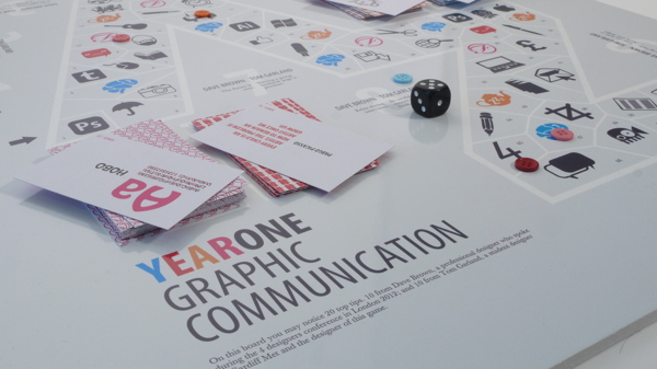
When on behance I found a board game that someone had come up with to communicate all the things that they had learnt in the first year of graphic design. An A-Z of graphic design. However the designer also gives tips on things to avoid doing when studying graphic design, Which will help me for my own concepts.
They have also created sets of cards to inform users of technical aspects of the course, definitions of terms and phrases, Font cards, to teach users about certain fonts and Quote cards that contain famous quotes from designers.


The game is presented as a police case file box. This theme is carried through with the instruction booklet, which replicates a police case file folder. As you unpack the game you are taken into the “big city” of the 1930s. The copy, typefaces, typography, graphic elements, and three-dimensional game components continuously reinforce the theme. After a rousing game of Alibi, the color and graphically keyed box interior ensures the game can be quickly and securely stored away. '


I had already found a style that I would like to illustrate in from a book I have recently bought called called 'A History of Graphic design for rainy days' of which I enjoy the process in why they have picked certain colours/ 2 colours plus stock per page. I like the use of two colours, and how they are used to create focus on certain parts of the story, eg. characters, a certain message, or a piece of graphic design.


Other students had also made post on the group similar to mine, and also had answers and so I will note down the responses to these aswell.
-That budgeting my money was something i should of done.
-Not to think having a student loan means you can go shopping for clothes and shoes rather than food.
I have seen from people's feedback that there is an emphasis on things such as blogging, a part time job, going out too much and not budgeting.
However After some thought I decided that I wanted to create something that could also act as an ice breaker, which would encourage the first years to interact with each other. In order to do this I thought I would create a board game incorporating the same concepts that I had pitched for the book.
Board game Concept.
Create a board game with a similar appearence to those such as snakes and ladders and monopoly.
Use a dice to move along the squares/spaces.
Create 3d card characters that appear like stereotypical graphic design students.
Incorporate cards when users land on certain spaces that send them back and forwards.
The Cards that send users forwards will be things students do to be more successful and ones that send users backwards will be things that first years shouldn't do, and will hold them back from acheiving.
There will also be cards, with need to know stuff about graphic design, that will increase the users knowledge and boost their points.
The person who gets to the end of the game with the most points, which marks completing the first year, will have made a journey across the board that shows people how to be more successful, the ones who finish the game with less points have had a more unsuccesful journey across the board and have learnt what not to do.
To research and design:
-Game board.
-How to play guide.
-Game box.
-Game cards.
-Cardboard characters (counters)
I am going to begin with some design concept research.
When on behance I found a board game that someone had come up with to communicate all the things that they had learnt in the first year of graphic design. An A-Z of graphic design. However the designer also gives tips on things to avoid doing when studying graphic design, Which will help me for my own concepts.
They have also created sets of cards to inform users of technical aspects of the course, definitions of terms and phrases, Font cards, to teach users about certain fonts and Quote cards that contain famous quotes from designers.


I also found some other designs on behance which I liked:
Behance
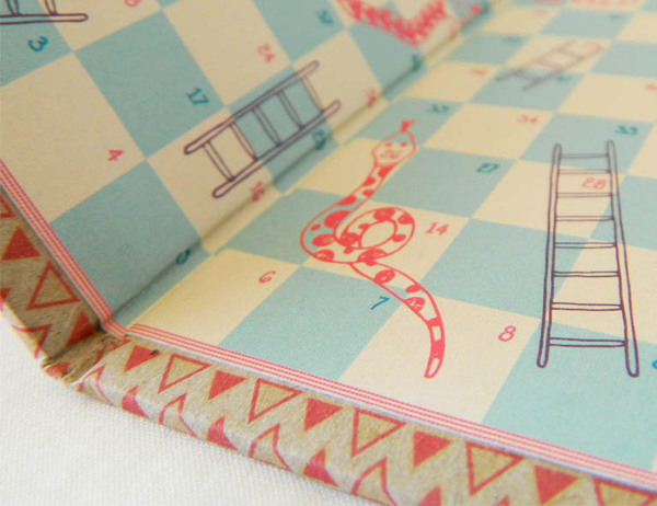
Although I thought about doing a snakes and ladders set up, where game players would move back and forth on the board due to landing on a snake or ladder alike space, this would not be based upon success or lack of success in the year and So I have decided against this idea.
Although I thought about doing a snakes and ladders set up, where game players would move back and forth on the board due to landing on a snake or ladder alike space, this would not be based upon success or lack of success in the year and So I have decided against this idea.

I also found this board game on behance, I like the shape in which the users have to travel in order to get to the end of the game. The use of shape is more interesting than the traditional checkered/box format such as those used in snakes and ladders and monopoly. The use of the shape also resembles the idea of a physical path which I find is more relevant to the idea of a journey. The implementation also allows space for compatible themed illustration, also semantically involved with the course.
I found another board game which I thought was themed really well, everything from the board itself, the box and how to play manual had been considered greatly to ensure they were consistent.
'ALIBI is a fast paced boardgame of intrigue and luck for 2-4 Players. The object of the game is to collect evidence [Coppers] or a rock-solid alibi [Gangsters] to present to the District Attorney. Players maneuver replica gangster cars or police paddy wagons during gameplay in a 1930s era setting.
The game is presented as a police case file box. This theme is carried through with the instruction booklet, which replicates a police case file folder. As you unpack the game you are taken into the “big city” of the 1930s. The copy, typefaces, typography, graphic elements, and three-dimensional game components continuously reinforce the theme. After a rousing game of Alibi, the color and graphically keyed box interior ensures the game can be quickly and securely stored away. '


I had already found a style that I would like to illustrate in from a book I have recently bought called called 'A History of Graphic design for rainy days' of which I enjoy the process in why they have picked certain colours/ 2 colours plus stock per page. I like the use of two colours, and how they are used to create focus on certain parts of the story, eg. characters, a certain message, or a piece of graphic design.


I do however also like the work of Graphic designer Kate Forrester, I particularly admire the way in which she designs, and like the element where she connects her main illustrations to the border of her works, almost in a paper cutting style. Attracting my illustrations to the edges of my board instead of around the path could be a more successful idea, as the images will not distract from playing the game.


This piece of work by Kate also applies to the idea I had previously stated where two colours could be used (against a different colour for backdrop) In order to initiate the story of the board game.


This pieces shows how small similar colours could be added in, in small doses to add extra detail and give more depth.


The above two Images show imagery connected with working, such as reading books and going on the computer, which could be good inspiration for any starting university imagery that i will need to make myself.

CONTENT
In order to get some primary research I asked the rest of my course, on our Facebook group, what they felt they have done and had been more successful on the course, and what they would recommend that they shouldn't do.

These were the responses that I recieved:
- I brought too much stuff to uni at first, less is more when you live only an hour and a half away.
- Not writing down notes in certain sessions, so haven't been able to remember what to blog.
Getting started on projects straight away so that I haven't rushed anything, and been able to do what I wanted. - part time job.
- Letting blogging build up.
- Not blogging enough and going out
-That budgeting my money was something i should of done.
-Not to think having a student loan means you can go shopping for clothes and shoes rather than food.
I have seen from people's feedback that there is an emphasis on things such as blogging, a part time job, going out too much and not budgeting.
I will use these don'ts for my playing cards alongside my own experiences and ones that I know others have talked about broadly.
I began to make a list of ideas for the 'UH OH!' cards, which will send users backwards on the board.
- You went out last night, stayed out too late and missed this mornings lecture.
- You handed in a module 2 days late and your grade is now capped by 10%.
- You were absent without proper reason and slowed down the progress of your group.
- You put off blogging until the end of the module and now you are behind.
- You were late for the train and have missed the morning briefing.
- You spent too long procrastinating and have only completed half of the task in for today.
- You have suffered a spell of creative block, step away from your work and take a short break.
- You spent too long with the other half this week and don't have much to present in crits tomorrow.
- You did an all nighter last night to finish a project but the work you produced wasn't great as you were too tired to concentrate. You now lack focus for todays classes.
- Oops! You quoted a designer/writer in an essay but did not reference it. This is a major issue!
- You spent all your money at the weekend and now can't afford to print your work. Remember to budget.
- You forgot to book a print slot and don't have anytime left. Remember to book in advance.
- You forgot the correct equipment and now you cannot complete the work in class.
- You didn't read the brief properly and have made some silly mistakes. Make sure to always have the brief at hand when completing projects.
- You skipped a class because you thought it wasn't relevant, but it was very important. All classes should be attended and offer a great learning experience.
- UH OH! You took on too many hours at your part time job this week and now you're struggling to keep up!
I have made a list of 16 don'ts here, I thought this was a well rounded number, as I plan to have 4 UH OH! spaces on the board. Having 16 of these cards means that if there were the maximum number of players playing (4) and they each landed on all 4 of the spaces, there would be a new card for each.
I then made a list of 16 for the success (Hell Yeah!) set. Many of the ideas I wrote down were opposites of the previous 16.
- You went out with friends last night but still managed to get a good nights sleep.
- You have finished all your module work 2 days before hand in and can afford to take a small break. Well done!
- You have 100% attendance and have turned up to every class. Great work!
- You have blogged everything you've done as you have gone along and you're on track for deadline.
- You have been visiting design blogs/ websites regularly to keep yourself informed with current design.
- You planned your morning well and have got to college 10 minutes before class starts.
- You booked a print slot in advance and your project is ready to be handed in.
- You managed to balance seeing the other half with work. It is important to have a balance between work and rest.
- You remembered the necessary equipment and completed work in class, instead of having to take it home to complete.
- You handed your last brief in with a great collection of supportive material, research, initial sketches, thumbnails and a range of design sheets. Keep up the good work!
- You did a great job working in a group last week by pushing your pride aside to do what was best for the group, your project was a big success.
- You took the time outside of college to visit an exhibition/ go to a graphic design event that furthered your knowledge.
- You notice some mistakes you've made after printing out your project but you have budgeted well and have more than enough money to reprint it.
- You took the time to go out and take your own photos for the next project where possible instead of relying on the internet.
- You took it upon yourself to go out and collect some primary research instead of relying on the internet. This proves good practice for the future.
- You made a study schedule and stuck to it and can move onto the next module with no overdue work on the back burner! Continue to do this for good practice.
You've got skills cards - 16 definitions/facts of terminology you will hear on your first year of the course.
Stock - The material that you are printing onto/ making a product out of. For example; Newsprint, card or wood.
RGB - RGB refers to the colour mode in which Images are displayed electronically, for example on screen.
CMYK - CMYK refers to physical colour such as paints and inks. When you are creating a piece of Graphic design on screen, make sure to convert the colour mode to CMYK before you print to see how the colours will translate in physical form.
Bleed - Bleed is the part of a printed document that is outside the bounds of the final size of the piece. It is used to make sure images and other design elements print all the way to the edge of the paper. This ensures that when the design is cut to size, it will fill the whole piece. quote
Body copy - Body copy is written text of an ad, brochure, book, or Web page. It's all the words. quote
Font - A font is a set of printable or displayable text characters in a specific style and size. The type design for a set of fonts is the typeface and variations of this design form the typeface family . Thus, Helvetica is a typeface family, Helvetica italic is a typeface, and Helvetica italic 10-point is a font. quote
Resolution - Resolution is the term used to describe the number of dots, or pixels, used to display an image. Higher resolutions mean that more pixels are used to create the image, resulting in a crisper, cleaner image. quote
Thumbnail - On the course you will most likely be asked to create a collection of thumbnails to support your work, this is referring to a range of small 'thumbnail' designs, which you will narrow down in order to come to your final design.
Typeface - The design of an alphabet or set of characters is a typeface. For example, Futura, Helvetica and Calibri. quote
Vector Image - Vector images are made out of lines and shapes in contrast to Raster images which are made out of dots or pixels. Vector images can be resized to any size desired and it will not affect the resolution of the image.
Raster Image - Raster images are made out of dots or pixels. When raster images are resized, more so when increased beyond their original size, it initiates a lower resolution.
Additive colour - If we are working on a computer, the colors we see on the screen are created with light using the additive color method. Additive color mixing begins with black and ends with white; as more color is added, the result is lighter and tends to white. quote
Subtractive colour - When we mix colors using paint, or through the printing process, we are using the subtractive color method. Subtractive color mixing means that one begins with white and ends with black; as one adds color, the result gets darker and tends to black. quote
Logo - A logo identifies a business in its simplest form via the use of a mark or icon. quote
Brand - The perceived emotional corporate image as a whole. quote
Identity - The visual aspects that form part of the overall brand. quote
I then moved onto creating content for my 'How to play guide' and decided what kind of things I would want to include.
- Welcome message.
- Amount of players.
- Aim of the game.
- Moving along the board.
- The 3 types of cards.
- Construct your own game piece.
Welcome message:
Hello! and welcome to your first year at Leeds college of art on Graphic Design. I know some of you might be scared (I know I was) and it all might seem a little over whelming. but just step back, take a breath and enjoy the journey you are about to embark on.
It might seem a little confusing at first and you'll wonder, like myself, how will I make it through the year? But that's why we're here! Us 'old folk' have put some things together to help make your first year a little easier. I decided that not only would I make something to help you out, I thought why not create something to help you break the ice and make a few buddies too! After all, us Graphic Designers son't all hate each other.
By the end of the game you should have hopefully learnt some tips and tricks of how to do well on the course, some don'ts that will hold you back from success, and a few definitions of Graphic Design terms that will help you get started. Good luck!
How to play:
2-4 players per game.
The aim of the game is to travel across the board, and collect as many points as you can. Your journey across the board is reflective of your journey through the year. The person who finishes the game with the most points has completed the year most successfully, and the person with the least points, is the least successful.
Each player has their own character which they will use to move across the board. Players more across the board by rolling the dice and advancing to the next space.
The fate of your success relies on three types of cards, 'Hell Yeah!', 'UH OH!' and 'You've got skills'. When you land on a space labelled with each of these you must pick up the correct card, read the message and follow the instructions.
Hell Yeah! - These cards display the things that will improve your success on the course. They will add points to your score.
UH OH! - These cards represent the things you should avoid doing as they will hold you back from being successful. They will deduct points from your score.
You've got skills! - These cards each include something important/ useful to know about graphic design and will increase your knowledge, they also increase your amount of points.
Construct your own game piece:
Pick which game piece you would like to represent you from the collection of four and simply construct your game piece as shown below.
(Add diagram at later stage when games pieces have been designed.)
Once you have finished the game take a chance to look back and see where you went wrong, and what you could do to be more successful. Good luck and enjoy the year!
You've got skills cards - 16 definitions/facts of terminology you will hear on your first year of the course.
Stock - The material that you are printing onto/ making a product out of. For example; Newsprint, card or wood.
RGB - RGB refers to the colour mode in which Images are displayed electronically, for example on screen.
CMYK - CMYK refers to physical colour such as paints and inks. When you are creating a piece of Graphic design on screen, make sure to convert the colour mode to CMYK before you print to see how the colours will translate in physical form.
Bleed - Bleed is the part of a printed document that is outside the bounds of the final size of the piece. It is used to make sure images and other design elements print all the way to the edge of the paper. This ensures that when the design is cut to size, it will fill the whole piece. quote
Body copy - Body copy is written text of an ad, brochure, book, or Web page. It's all the words. quote
Font - A font is a set of printable or displayable text characters in a specific style and size. The type design for a set of fonts is the typeface and variations of this design form the typeface family . Thus, Helvetica is a typeface family, Helvetica italic is a typeface, and Helvetica italic 10-point is a font. quote
Resolution - Resolution is the term used to describe the number of dots, or pixels, used to display an image. Higher resolutions mean that more pixels are used to create the image, resulting in a crisper, cleaner image. quote
Thumbnail - On the course you will most likely be asked to create a collection of thumbnails to support your work, this is referring to a range of small 'thumbnail' designs, which you will narrow down in order to come to your final design.
Typeface - The design of an alphabet or set of characters is a typeface. For example, Futura, Helvetica and Calibri. quote
Vector Image - Vector images are made out of lines and shapes in contrast to Raster images which are made out of dots or pixels. Vector images can be resized to any size desired and it will not affect the resolution of the image.
Raster Image - Raster images are made out of dots or pixels. When raster images are resized, more so when increased beyond their original size, it initiates a lower resolution.
Additive colour - If we are working on a computer, the colors we see on the screen are created with light using the additive color method. Additive color mixing begins with black and ends with white; as more color is added, the result is lighter and tends to white. quote
Subtractive colour - When we mix colors using paint, or through the printing process, we are using the subtractive color method. Subtractive color mixing means that one begins with white and ends with black; as one adds color, the result gets darker and tends to black. quote
Logo - A logo identifies a business in its simplest form via the use of a mark or icon. quote
Brand - The perceived emotional corporate image as a whole. quote
Identity - The visual aspects that form part of the overall brand. quote
I then moved onto creating content for my 'How to play guide' and decided what kind of things I would want to include.
- Welcome message.
- Amount of players.
- Aim of the game.
- Moving along the board.
- The 3 types of cards.
- Construct your own game piece.
Welcome message:
Hello! and welcome to your first year at Leeds college of art on Graphic Design. I know some of you might be scared (I know I was) and it all might seem a little over whelming. but just step back, take a breath and enjoy the journey you are about to embark on.
It might seem a little confusing at first and you'll wonder, like myself, how will I make it through the year? But that's why we're here! Us 'old folk' have put some things together to help make your first year a little easier. I decided that not only would I make something to help you out, I thought why not create something to help you break the ice and make a few buddies too! After all, us Graphic Designers son't all hate each other.
By the end of the game you should have hopefully learnt some tips and tricks of how to do well on the course, some don'ts that will hold you back from success, and a few definitions of Graphic Design terms that will help you get started. Good luck!
How to play:
2-4 players per game.
The aim of the game is to travel across the board, and collect as many points as you can. Your journey across the board is reflective of your journey through the year. The person who finishes the game with the most points has completed the year most successfully, and the person with the least points, is the least successful.
Each player has their own character which they will use to move across the board. Players more across the board by rolling the dice and advancing to the next space.
The fate of your success relies on three types of cards, 'Hell Yeah!', 'UH OH!' and 'You've got skills'. When you land on a space labelled with each of these you must pick up the correct card, read the message and follow the instructions.
Hell Yeah! - These cards display the things that will improve your success on the course. They will add points to your score.
UH OH! - These cards represent the things you should avoid doing as they will hold you back from being successful. They will deduct points from your score.
You've got skills! - These cards each include something important/ useful to know about graphic design and will increase your knowledge, they also increase your amount of points.
Construct your own game piece:
Pick which game piece you would like to represent you from the collection of four and simply construct your game piece as shown below.
(Add diagram at later stage when games pieces have been designed.)
Once you have finished the game take a chance to look back and see where you went wrong, and what you could do to be more successful. Good luck and enjoy the year!
Subscribe to:
Posts (Atom)