Sunday, 28 December 2014

OUGD601 / Context of Practise - Practical element: Heavenly packaging.

OUGD601.
PRACTICAL ELEMENT. 

HEAVENLY PACKAGING. 

I am basing the dimensions of the chocolate bar off of already existing chocolate bars. The bar I will be designing for is of a larger size than an everyday chocolate bar and is one than can be considered a tear and share. 

I will be using a Green and Black's chocolate bar measurements to create the packaging for my own bar. When considering how to do the packaging I wanted to consider how to make the chocolate bar look as normal as possible. Often, organic chocolate bars are packaged in boxes, made from rough card, however I feel that this aesthetic in particular gives the packaging a luxury feel which is something I am trying to avoid. Instead I have decided to go for a sleeve which will wrap around a foil covered chocolate bar. This method is not often used anymore, (can be seen on galaxy chocolate) and therefore It will stand out on the shelf. 


Using the Green and Blacks chocolate bar I came up with a net size for the sleeve.


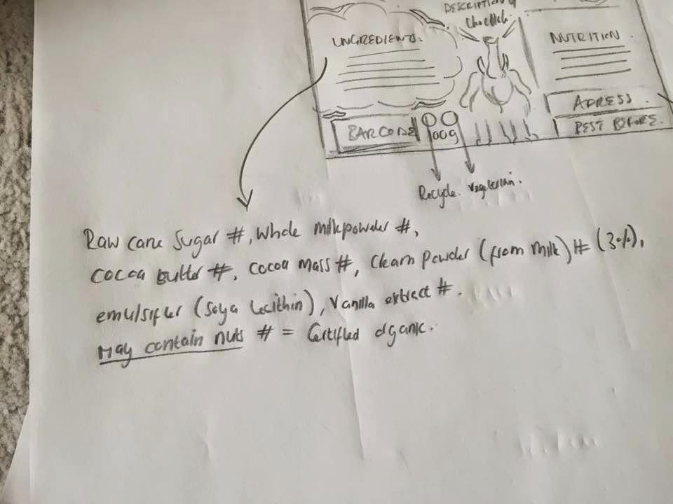
Next I will use the Green and blacks chocolate bar to distinguish the groups of information that needs  to go on the back of the chocolate bar packaging. 

-Brand name. 
- Ingredients.
-Nutrition information. 
- Barcode. 
- recycle symbol. 
- Address of company for any issues. 
 This product meets the Roundtable of sustainable palm oils standards for palm oil harvesting. 
- Best before.
- Size of bar - recycle shortened symbol - Suitable for vegetarians. 

I want the back of the packaging to be as illustratively interesting and appealing as the front. I began to section the back into areas of where to place information. I followed the terms of heirarchy as seen on the back of chocolate packaging first introducting the brand and flavour and RSPO, then ingredients and nutrition, and towards the bottom; weight, recycling, address, best before and barcode.

I have added illustrative elements such as the clouds, beams and stars seen on the front of the packaging for consistency and inclusion of illustrative elements such as the elephant, whom is part of Heavenly's sustainable story, however this is not made obvious on the packaging. 


Stock ingredients for the sake of the packaging have been taken from the back of a Green and blacks bar.


As has the mock address for the company. 


Next I went onto making the original front cover of the chocolate bar, proportional to the net I have measured out. 


OUGD601 / Context of Practice - Practical element - Design development.

OUGD601.
PRACTICAL ELEMENT.
DESIGN DEVELOPMENT.

I wanted the logo of the brand to represent an element about the chocolate but also visually reflect the brand name. For these two reasons I started looking at script lettering, as I felt that this area of typography represented the smoothness of chocolate and aesthetically echoed the visual of the word heavenly, creating and appealing and attractive flow. 

With this in mind I began looking at script type samples using the brand name.


Although I felt that none of them fully represented the smoothness I had envisioned for the logo, I felt that one of the type samples was workable:


Although this typeface is not as clean as I was wanting, I felt that it encompassed the fluidity I was looking for in the text and that the clean lines could be editable. 

 I began to experiment with the typeface on paper, making it slightly thicker, and giving the type straighter angles and lines. 


I also gave the first and last letters of the brand name more ornamentation, to increase attraction to the eye, and to make the word look more balanced. Here I redrew the logo with straighter lines. 


However I wasn't sure whether the straight edges made the logo look too formal, and therefore I also experimented, making the logo with rounder edges. 


Although I felt that the rounded edges were much more appealing and reflective of what should be a less luxurious brand, I felt that the added outline around the perimeter of the text cheapened the logo too much and therefore I drew the rounded edge text again, without this added ornamentation.  


As I was redrawing the logo, and, being happy with it, I began working on the visuals surrounding the type on the packaging. which also played with the meaning of the brand name creating visuals of clouds and light. 

I want to steer away from a colour pallet using any type of green as the idea in reflection to the research undertaken for my dissertation is to market green products with no difference to regular products. However I had to pick colouring carefully, as many colours when associated with food can be off putting. (http://www.colormatters.com/color-and-the-body/color-and-appetite-matters) The most appetising foods are those with colours commonly found in nature. It is important that at first sight edible food appears appetising. Therefore when thinking about colours for the heavenly brand I instantly thought about the colour of the product itself, making the packaging of the product look good enough to eat. I wanted to appeal to again the smoothness, and heavenliness of the chocolate, however I did want to give a subtle nod towards a more natural look. In order to do so I looked into chocolate rendered Type. 

Below is some chocolate rendered type (top) by Moonstruck and (below) by Jessica Hische for Dove chocolate. I feel that colour psychology and how appetising the design appears definitely helps to sell edible products, and therefore I feel that marketing the packaging to look like debossed chocolate type/ carved into chocolate will appear more appetising to customers, whilst still appearing more natural.


I do however feel that the first use of this style by moonstruck would be more appropriate for my chocolate branding. Although the second by Dove does work, I feel it looks too over manufactures and perfect, whereas the first use by Moonstruck looks more natural and realistic. This is a style I am hoping I can recreate with the help of programs such as Photoshop and Sketch Up. 


Saturday, 27 December 2014

OUGD601 / Context of Practice - Practical element: Building the brand.

OUGD601. 
PRACTICAL ELEMENT. 
BUILDING THE BRAND. 

FOCUS on a name to communicate the chocolate itself, something about its taste, texture or other attribute that puts it above others. But also consider how the name could also, if possible reflect the green attributes of the brand. The aim is to appear as a regular chocolate bar brand, but also be clever about the inclusion of green morals.

Firstly I look at names to describe an element that is so desired in chocolate - the smoothness and creaminess.


Smooth:


I didn't feel that any of the adjectives found in this list were appropriate names for a chocolate brand. I found the term Velvety both in this list and the one below, however I know that this adjective in particular is often used by chocolate brand galaxy, and I didn't want there to be any misconceptions or mix ups about the origin of the brand and so It is best to avoid this term completely. 

Creamy:


Again a lot of the terms achieved from this word search produced a list of adjectives that weren't particularly appetising for edible products. Next I searched a word that was particularly based upon a strong edible sense. 


Delicious:


From this list I found the adjective heavenly which I felt was a great name for a chocolate bar company, as customers would first associate the name of the brand with the taste and feel of the chocolate, but the name could and would also describe the nature of the brand. And so... Heavenly by name, Heavenly by taste, Heavenly by nature. 


THE HEAVENLY BRAND

Heavenly needs to define itself as a brand to follow not only in branding sustainable or green chocolate, but a brand for sustainable products, services and causes as a whole. For this reason, Heavenly aims to create a system based upon the ways to attract 21st century consumers defined in 'How can sustainability be made more attractive to the 21st century consumer?'

Competitive with its competitors:
The chocolate brand needs to be compete with rivals, not based upon how 'sustainable' or 'green' the brand is, but on all other elements that consumers look for in a product. 
- How well does it function/ does it function the best?
- How attractive is the packaging?
- What descriptors are used to sell the product 'great for the environment' or 'deliciously tasty'.


Tone of voice and communication:
In terms of communicating anything to do with the brands sustainable morals, this need to be done in a simple clear and inviting way. 
- If sustainability is marketed with a lot of complexity, it becomes too difficult for the consumer to understand and interest is lost. 
- Heavenly also needs to be light hearted in its tone of voice, although the effects of unsustainable palm oil are unbelievably serious including deforestation, destruction of animal habitat and species, and sometimes villages. However Heavenly must talk about such issues in a light hearted manner, not i an educational way but much more conversational, the idea is to talk to the consumer over teach them

Mood:
The key is to be positive when marketing sustainability as when laced with doom and gloom, consumers become very stressed, and therefore want to run in the opposite direction. If sustainability is communicated in a positove and aspirational way, consumers will want to be involved as the positive vibes from involving themselves will over fill into their own lives. 

Gains over sacrifices:
Often sustainable as spoken about by Steve Howard in his TED Talk (Let's go all out on Selling Sustainability) was thought as of compromise, and also sacfrifice. Heavenly must focus on what the consumer gains from the product. They must gain the tastly delicious treat that will sedate their chocolate craving when buying the product, not buy something that just taste ok, but works wonders for something they feel is entirely seperate to their lives (for example animal habitat in Indonesia). (Often the consumer is disinterested with such issues as they don't have much of a direct affect on their lives.

Colour:
Therefore It is important that the product distances itself from other traditional sustainable products with a marketing focus of being green. This also includes choice of colour pallet. In order to attract 21st century consumers Heavenly must distance itself aesthetically from other green brands, which means subtracting the colour green out of the design equation almost absolutely. Instead the upmost importance will be what is the best set of colours to sell the product, more so as this is an edible product, what colours would be most appetising?


OUGD601 / Context of Practice - Analysing green campaigns.

OUGD601.
PRACTICAL ELEMENT. 
ANALYSING GREEN CAMPAIGNS. 


Velvet toilet paper:


In the ad, Velvet is firstly announced as a luxury toilet tissue, which goes hand and hand with its name Velvet. This is the priority of the brand, first to appeal to consumers through the greatness of the product and then through the sustainable cause of planting 3 trees for every one used. 'So if you like things that are soft soft soft and if you like trees, well obviously'. The ad also has a friendly and conversational tone in its speech, as if speaking to you in a real conversation over something trying to educate. The ad is also light hearted and quite funny, taken away is the seriousness and doom and gloom of deforestation and put in its place is the fruition and power of the consumers one small action of buying velvet toilet roll. 'Treemendous'.


'So far by choosing velvet you've helped us by planting 6 million trees around the world.'
The campaign doesn't focus on what hasn't been done but the great achievments that have already been gained from the consumption of the product. It can be seen that Velvet is a successful sustainable brand, as in the previous ad they desired the want to plant 6,000,000 million trees, an achievement tracked in this ad. 


Charity water:


Although water charity does start on a note of doom and gloom, the way in which it is communicated is educational, with a voice that is telling you, over conversing. However over being powerfully instructional, viewers are taken in by the narrative like story. 

'Until, they get a little help.'

'little' is used to describe the solution, offering the viewer the perception that improvements to water systems will not take a lot of their effort and self sacrifice. little, offers the idea of a simple solution, of which simple solutions are clearly listed. Another persuasive techinique used and often spoken about in the written element of this project is empowerment of the consumer, the consumer is shown just how much power their contribution will have by improving the lives of people in need, and not just improvement of water systems. 'This will mean more than clean water because water changes everything'.


Wednesday, 24 December 2014

OUGD601 / Context of practice 3: Chocolate branding.

OUGD601.
PRACTICAL ELEMENT. 
CHOCOLATE BRANDING.

Nib mor:


Nib mor are a great attractive brand whom are organic, ethically graded and part of the rainforest alliance. Although there is subtle evidence of this information on the packaging, the main focus is on the flavours and textures of the chocolate for example; mint, crispy and almond. There is also a visual play on words with the brand name. 'Nib mor' in reference to nab more means to quickly take more of something, a visual shown via the hand 'nibbing' the chocolate. Colours are used to reference the product (chocolate and therefore brown) and the array of flavours (mint is mint green, almond is cream).


Pana chocolate:


Pana Chocolate is greatly attractive in its branding with an identifiable selection of attractive and simple illustrations. Whilst the packaging wholly refers to the product in colour (brown), the illustrations give some kind of aesthetic idea towards the added flavours of the product, which is also illustrated. I do however feel that the packaging would work better with a different stock, as the combination of words Raw/ organic/ handmade combined with said grainy stock appears to appeal to a niche group of customers, when the aim is to encompass all customers. The use of the box for packaging, and the inability to feel the shape or see the product gives the brand a luxurious feel when paired with the matte silver foil, which is also something to avoid, as spoken about by Steve Howard in his TED talk, on selling sustainability. 


iQ Superfood chocolate:


iQ superfood chocolate is the type of branding that I need to avoid. The whole brand relies upon the idea of being clever and smart, which can be seen as quite patronising. The bar is also labelled with the slogan 'The clever little chocolate bar' however this is not a selling point attractive at all to consumers. Customers do not want their chocolate to be smart, they want it to be delicious, tasty and mouth watering. Other than visuals that refer to cleverness, the others refer to flavour, however it can be seen on the original bar where there is no extra flavour that there is grass. This is an attitude that needs to be left behind in 21st century sustainable marketing. Therefore this chocolate bar is only attractive to a VERY niche audience whose number one priority and upmost desire is to purchase something that is organic and green. 


Ka kau:


Although Ka-kau does appear quite organic, this is done well and appears quite attractive. Using a pallet of attractive earthy colours the packaging nods towards its organic roots, also represented in a simple illustrative pattern of cacao beans appearing both natural and attractive. Although the minimalist labels appear quite luxurious, they in their minimalist style are also simple and easy for a consumer to comprehend.  


Organic Meltdown:


Organic Meltdown is another very green focused chocolate bar, which again focuses more on the selling of sustainability than the selling of the actual physical product. Sustainable products need to sell the physical product more than the cause, otherwise they might as well subtract the chocolate bar out of the equation. Using the word organic in the title of the brand is already a let down, when people picture organic, initial thoughts are green, leaves, earth etc which is not an appetising thought to associate with chocolate. When 21st century consumers go out with the intention of buying chocolate, they want something yummy and delicious, and if they find this, and then realise that it is also good for the environment, that is just an extra perk. 


Theo:


Theo is a great organic chocolate bar line that is appealing at the fore front for its bright and attractive packaging. The chocolate gives slight hints to its organic background, through subtle elements such as the organic, hand drawn and illustrated logo. The chocolate bar does mention that it is organic which it should, but it does do this in a glaring way, first and foremost is the name of the brand which has no obvious green connotations, and flavour.  Which as previously mentioned should sell the brand of the chocolate.


Tuesday, 23 December 2014

OUGD601 / Context of practice 3 - Practical element: Chocolate concept.-

OUGD601.
PRACTICAL ELEMENT. 
CHOCOLATE REBRAND. 


The original concept of my COP 3 proposal was to rebrand an already existing CSPO (Certified sustainable palm oil) chocolate bar, and market it, as I have discovered best in researching my dissertation. However via a search I have not been able to find a small CSPO chocolate brand. However I did find the chocolate bar below called Endangered species chocolate, in which, through its range of filled chocolate bars aims to support species conservation and habitat preservation by donating 10% of net profits to partner organisations such as; the African Wildlife foundation and Xerces society.


My aim is to create a chocolate bar brand that carries the same aims of species conservation and habitat preservation, where palm oil is sustainably harvested. The focus of sustainable harvest for Endangered species chocolate is protect animal habitat and life via sustainable cacao harvesting. I want my branding and marketing to act as a standard or example as to what marketing and branding should entail when working with sustainable/ green products, services and causes.  

For the chocolate bar branding I am to create a brand including logo and packaging. 
With large scale printed marketing such as billboard and bus shelters.
An animated campaign talking about the great initiative of the CSPO chocolate in relation to animals and habitats.

In terms of the design I aim to listen to that desired in my dissertation and brand and advertise the chocolate to be better over greener. To compete with all chocolate bars on elements of fun, creativity, simplicity, honesty and aesthetic. When talking about the CSPO initiative I am to do so in a positive and interactive way, that will act as an add on to the already established delicious chocolate brand, over that being the sole tool for the brand. 

What I need to look into:
- Creative chocolate branding and packaging. 
- Successful chocolate brands. 
- Sustainable and unsustainable harvesting of Palm oil.
- Successful and unsuccessful green campaigns / initiatives.